Correlations and contaminated pollen
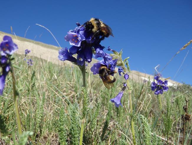
Credits: Zoë Maffett
Learning goals for today’s assignment
Describe the utility of fitting trendlines to data, in the context of making predictions about the future
Use best-fit lines to make predictions
Quantitatively and qualitatively describe how to determine the goodness of fit for a given line
Assignment instructions
Work with your group to complete this assignment. Instructions for submitting this assignment are at the end of the Notebook. The assignment is due at the end of class.
Background
As willows move higher with climate change, they will drive postpollination interference, reducing the fitness benefits of pollinator visitation for Polemonium viscosum (alpine skypilot) and selecting for traits that reduce pollinator sharing. The authors probed potential impacts of interference from encroaching Salix (willows) on pollination quality of Polemonium. Overlap in flowering time of Salix and Polemonium is a precondition for interference.
Pollinator sharing was ascertained from observations of willow pollen on bumble bees visiting Polemonium flowers and on Polemonium pistils. The authors measured the correlation between Salix pollen contamination and seed set in naturally pollinated Polemonium.
Credits: Kettenbach et al 2017
The data comes from:
Kettenbach JA, Miller-Struttmann N, Moffett Z, Galen C. (2017) How shrub encroachment under climate change could threaten pollination services for alpine wildflowers: A case study using the alpine skypilot, Polemonium viscosum. Ecol Evol. 7: 6963–6971.
✅ Question 1
What is reflected on the x-axis?
What is reflected on the y-axis?
In your own words, what information do you get out of this figure?
✎ Put your answer here.
1. Setting everything up
Before jumping straight into correlations, we need to go through the usual setup steps.
✅ Task 2
Import the usual suspects: NumPy, pandas, matplotlib
To compute correlations and p-values, we will need one more import: the
statssubmodule from thescipymodule.
SciPy is the scientific library of Python and it contains several useful submodules for all sorts of statistical and computational tasks. SciPy is the last piece of this course’s “quadfecta”.
# Import the rest of needed libraries

from scipy import stats
Remember that it is always good coding practice to import your libraries at the top before doing anything else.
✅ Task 3
With pandas, load the dataset
salix+and+pv+phenology+data.csvDisplay its first few rows to make sure everything worked as expected
# Load the data
✅ Question 4
What columns will you need to reproduce Fig. 2 from Kettenbach et al. (2017)? This is a different figure from the one above.
✎ Put your answer here.
✅ Task 5
With matplotlib, make a scatterplot of Polemonium vs Salix Julian day of flowering, like Fig. 2 from the reference paper.
Make sure to label your axes
Note: You can do facecolor='none', edgecolor='red' to get empty markers with a red edge.
# Your code✅ Question 6
Do you think flowering day times between Salix and Polemonium are correlated? If so, does the correlation look linear to you?
Will the correlation coefficient be positive, negative, or close to zero? Explain your answer.
✎ Put your answer here.
2. Computing Pearson correlation with stats.pearsonr
With the SciPy’s stats module, we can compute the Pearson correlation coefficient and its associated p-value with the stats.pearsonr. That function will return a named tuple.
A tuple is almost like a list: you can have all sorts of variables in a tuple. You can access them via indices. But you cannot modify the items in a tuple.
A named tuple is a tuple where you can access its items with a name rather than an index.
See the snippet below:
# store the results in a named tuple
pearson = stats.pearsonr(x_axis_values, y_axis_values)

# This tuple has two names:
# - statistic (the coefficient)
# - pvalue
# You access them with a dot . instead of using an index and square brackets [i]
print('The Pearson coefficient is', pearson.statistic)
print('Its associated p-value is', pearson.pvalue)
Check its documentation for more details.
✅ Task 7
Compute and print the Pearson correlation and its associated p-value between Salix and Polemonium flowering days.
# Your code✅ Question 8
Does the coefficient match your guess from Question 6?
Do your reported values match the ones reported in Figure 2’s caption?
How do you interpret your reported p-value?
Overall, what can you say about Polemonium and Salix flowering times?
✎ Put your answer here.
3. Computing Spearman correlation with stats.spearmanr
SciPy also comes with an easy way to compute Spearman correlation with stats.spearmanr. It works pretty much the same as stats.pearsonr. Check its documentation for more details.
✅ Task 9
Compute and print the Spearman correlation and its associated p-value between Salix and Polemonium flowering days.
# Your code✅ Question 10
How different are the two correlation coefficients?
Does the difference, or lack thereof, make sense to you? Explain your answer.
Do the Spearman correlation results change or reinforce your interpretation of Polemonium and Salix flowering times as in Question 8?
✎ Put your answer here.
4. Data wrangling and more correlation practice
✅ Task 11
Now look at the Figure 3 from Kettenbach et al (2017). Using the same data you loaded for Part 1:
Make a scatterplot of Salix Julian flowering day versus minimum June temperature
On the same plot, make a scatterplot of Polemonium versus temperature?
Add labels and legends
# Your code4. Data wrangling and more correlation practice
✅ Task 11
Now look at the Figure 3 from Kettenbach et al (2017). Using the same data you loaded for Part 1:
Make a scatterplot of Salix Julian flowering day versus minimum June temperature
On the same plot, make a scatterplot of Polemonium versus temperature?
Add labels and legends
✅ Question 12
Looking at the plot alone:
Do you think temperature is correlated with any of the plants’ flowering day? If so, is the correlation linear?
Does one plant seem more correlated than the other?
How can this correlation, or lack thereof, can be interpreted in terms of climate change?
✎ Put your answer here.
Ideally when handling data, you would like to just focus on computing this or that statistic. But you always have to keep in mind that some ad-hoc data wrangling comes first. And you don’t know it until you see it.
✅ Task 13
Compute the Pearson correlation betwen minimum June temperature and Salix flowering day?
Did you get the expected result?
# Unless you get a red error, you're not doing anything wrongThere are many reasons you can get an unexpected NaN (“not a number”, remember them from Day 11?) The most common reasons are:
We are trying to do an undefined math computation (like dividing by 0, log-transforming a negative number, or trying to correlate a single data point).
There is a NaN elsewhere that is messing things up downstream.
The math behind correlation coefficients should always produce a number, so most likely there’s a NaN in the original data.
✅ Task 14
Use
.dropnato drop the rows that have NaNs in either the Julian day flowering columns or the temperature columnSave the modified dataframe in a different variable: we want to keep the original data around
Compare the length of the original dataframe vs the modified one: how many rows did you actually drop?
Check in-class 11 if you need to remember how to use .dropna
# Your code✅ Task 15
Now try to compute again the Pearson correlation coefficients between.
Do the correlation coefficients agree with your intuition from Question 12?
# Your code✎ Put your answer here.
5. One more practice (time-permitting)
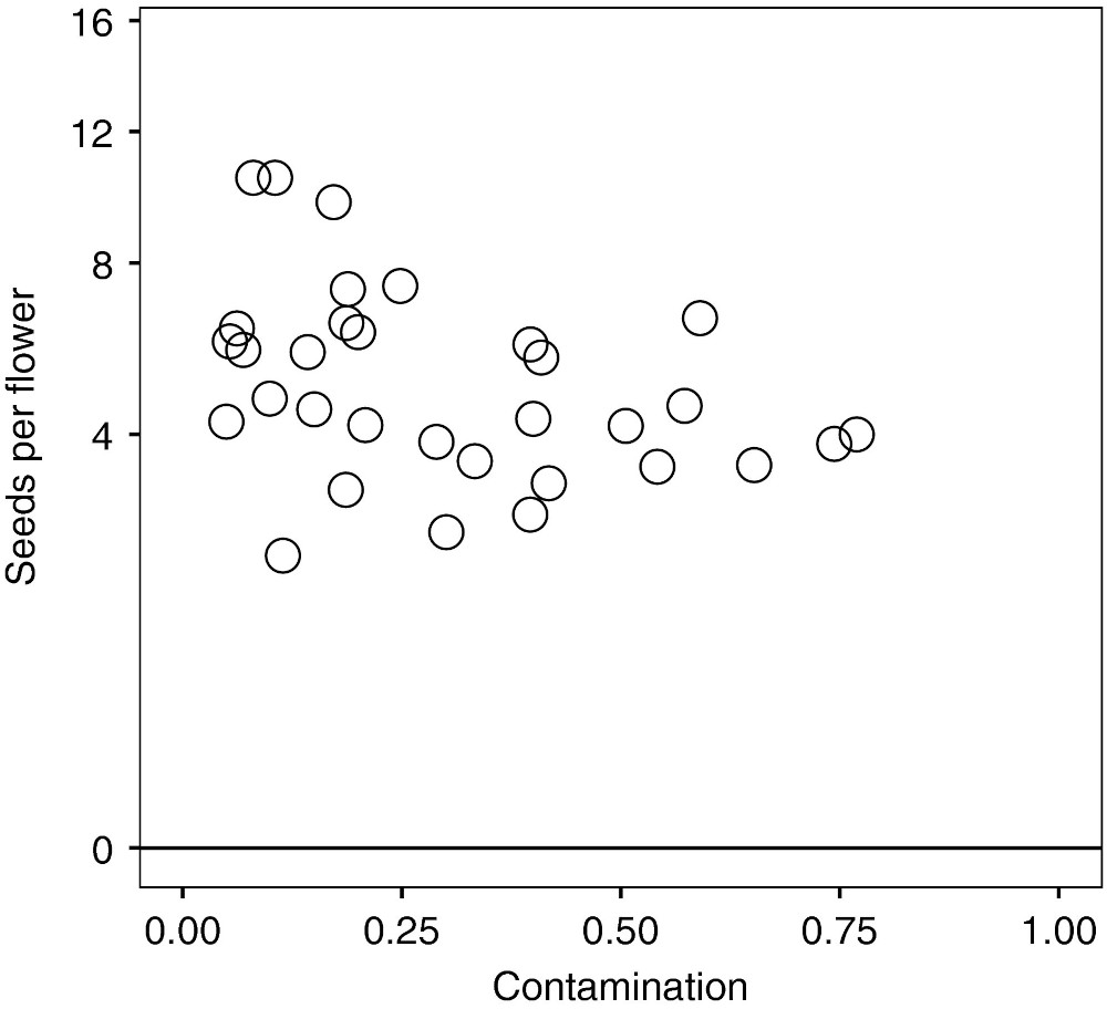
Now let’s turn to Figure 5 from Kettenbach et al.
✅ Task 16
In one or more cells, you’ll essentially repeat Parts 1 and 3:
Load the dataset
pollen+purity+vs+seed+set.csvand check its first few rows.Identify which columns you need to reproduce Fig.5
Make a scatterplot of seeds per [Polemonium] flower versus contamination (percentage of Salix pollen found around)
Compute the Pearson and Spearman correlations between these two variables.
# Load the data# Scatterplot# Correlations✅ Question 17
Do the coefficients match your observation from the scatterplot?
Does the Spearman coefficient agree with the one published by Kettenbach et al? (Look at Figure 5’s caption).
Are the Pearson and Spearman coefficients very different of each other?
What does their difference, or lacktherof, tell you of the relationship between contamination and seed number?
✎ Put your answer here.
Congratulations, you’re done!
Submit this assignment by uploading it to the course Canvas web page. Go to the “In-class assignments” folder, find the appropriate submission link, and upload it there.
See you next class!
© Copyright 2026, Division of Plant Science & Technology—University of Missouri
- Kettenbach, J. A., Miller‐Struttmann, N., Moffett, Z., & Galen, C. (2017). How shrub encroachment under climate change could threaten pollination services for alpine wildflowers: A case study using the alpine skypilot,Polemonium viscosum. Ecology and Evolution, 7(17), 6963–6971. 10.1002/ece3.3272