✅ Put your name here
Predicting unobserved values and determining a good fit
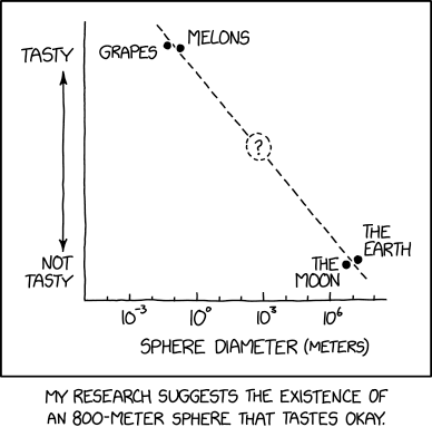
Credits: xkcd.com
Learning goals for today’s pre-class assignment
Be able to articulate what regression is and why we use it
Use NumPy to fit a specific polynomial function to data
Describe the nature of building and using models to understand the world
Assignment instructions
This assignment is due by 11:59 p.m. the day before class, and should be uploaded into the appropriate “Pre-class assignments” submission folder. If you run into issues with your code, make sure to use Slack to help each other out and receive some assistance from the instructors. Submission instructions can be found at the end of the notebook.
1. Linear regression
In many applications, data depends on other data. Dependent and independent variables. For example, in the past in-class we saw that there is a correlation between the number of days needed for willow (Salix) to flower and summer temperature. This means that there is a mystery function that by knowing temperature, we can predict the flowering day:
Unfortunately, real data is always imperfect. We often say that the data has “noise” or “fluctuations”. The problem is that we know that some of these fluctuations are not real: they are caused by errors in our measurements or any other factor that is not in our control. We do not want to take those fluctuations into our model: we just want the trend. Regression solves this problem by providing a methodology to find a smoother function that is consistent with your data but doesn’t attempt to match every detail, which may or may not be a real signal.
A common form of regression is called simple linear regression. Simple linear regression finds the best line that goes through noisy data. For example, looking both at scatterplot and at the Pearson correlation coefficient, we know that it makes sense to fit a line between temperature and willow flowering day.
Watch the following video on what makes a line the best fit line AND how to assess its “goodness of fit”
You just need to watch the video until the 12:10 mark, when he discusses:
Least Squares to fit a line to the data.
The meaning of .
Don’t worry much about his references to previous videos or the formulas, but focus on how to interpret the values.
from IPython.display import YouTubeVideo
YouTubeVideo("7ArmBVF2dCs",width=640,height=360, end=12*60+11) ✅ Question 1
In your own words, explain why linear regression can be useful for data analysis
✎ Put your answer here.
✅ Question 2
is sometimes referred to as the coefficient of determination.
Explain what is the difference between a coefficient of correlation and a coefficient of determination. Your best guess is fine.
✎ Put your answer here.
Remember at the end of the StatQuest on correlation (from last pre-class), Josh mentioned that while correlation coefficients are useful to determine if two variables are linearly related, the exact values are hard to interpret. Read this in Josh’s voice:
Say that for an experiment you measure mouse age, weight, and size. You find that:
Age and weight are correlated with a coefficient of 0.8.
Age and size are also correlated, but only with a coefficient of 0.4.
Does that mean that age is “twice as correlated” to weight compared to size? What does “twice as correlated” mean in the first place?
✅ Question 3
Do you think would be a better way to understand the relationship between mouse age, weight, and size? Explain your answer.
✎ Put your answer here.
2. Computing linear regressions with stats.linregress
Remember that in general a line equation is For the temperature-day relationship from last class, a large Pearson correlation coefficient usually suggests that it is sensible to fit a line to the data. To perform a linear regression we need to figure out the best and values so that the formula
is the most predictive.
Good news: SciPy’s stats submodule can also do that for us!
2.1 The usual setup
In the previous in-class, we saw that Kettenbach et al (2017) fitted linear models between temperature and flowring days (Figure 2). Let’s reproduce them. Before jumping straight into linear regression, we need to do the standard steps:
Import the usual modules
Load the data
Remove pesky NaNs
Plot the data to make sure it makes sense to fit a line
import pandas as pd
import matplotlib.pyplot as plt
import numpy as np
from scipy import stats
pheno = pd.read_csv('salix+and+pv+phenology+data.csv').dropna(axis=0, how='any')
print(pheno.shape)
pheno.head()(24, 8)
temp = pheno['min temp June']
salix = pheno['julian day - Salix']
polemonium = pheno['julian day - Polemonium']

# What parameters have you not used yet?
# Comment those and make sure you understand what they do
fontsize = 12
fig, ax = plt.subplots(figsize=(7,5))
ax.set_facecolor('snow')
ax.scatter(temp, salix, marker='o', ec='r', fc='none', lw=2, alpha=0.75, label='Salix')
ax.scatter(temp, polemonium, marker='^', ec='royalblue', fc='none', lw=2, alpha=0.75, label='Polemonium')
ax.legend(loc='upper right', fontsize=fontsize, facecolor='lightgray', framealpha=1)
ax.set_ylabel('Julian day of flowering', fontsize=fontsize)
ax.set_xlabel('Min. daily June temperature [$^{\\circ}$C]', fontsize=fontsize)
ax.tick_params(labelsize=fontsize);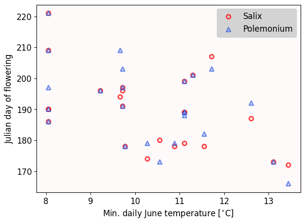
✅ Task 2
Are there any functions or parameters that you were not aware of in the matplotlib code above? Comment the bits of code that are new to you.
If you are unsure what a parameter does, try changing its value and see what happens.
2.2 Using stats.linregress
# the order of variables DOES matter
stats.linregress(x_axis_values, y_axis_values)
If you read stats.linregress documentation, you’ll realize that it returns another named tuple (like stats.pearsonr) but it has more stuff and more names. The ones we care for are:
.slope: The value in the formula we stated at the beginning of Section 2.intercept: The value.rvalue: Pearson’s coefficient.pvalue: p-value associated to Pearson’s coefficient
# Computing a linear regression between Salix flowering days and temperature
regression = stats.linregress(temp, salix)

print(f'Slope:    \t{regression.slope:.2f}')
print(f'Intercept:\t{regression.intercept:.2f}')
print(f'Pearson r:\t{regression.rvalue:.2f}')
print(f'p-value   \t{regression.pvalue:.2f}')
Slope: -3.70
Intercept: 228.01
Pearson r: -0.48
p-value 0.02
Our data then suggest us that the best linear formula between flowering days and temperature is:
Interpreting the numbers in a linear model
The slope tells us how much does the -axis value change for a unit increase of the -value.
In this case, for every degree Celcius that the minimum temperature increases, it takes 3.7 less (Julian) days for willow to flower.
The intercept tells us the -axis value when the -value is zero.
If the min. temperature is 0°C (freezing), then willow will need 228 days to flower.
✅ Quick Question
Does our formula match with the one computed by Kettenbach et al.? Check the caption of Figure 3.
2.3 Making predictions
Let’s use our formula to predict the Julian day of flowering for unobserved temperatures.
t = 20 # 20C ~ 68F
day = regression.slope * t + regression.intercept
print('If the min temperature in June is', t, 'C, then willow will need', round(day), 'days to flower.\n')

t = 2 # 2C ~ 36F
day = regression.slope * t + regression.intercept
print('If the min temperature in June is', t, 'C, then willow will need', round(day), 'days to flower.')
If the min temperature in June is 20 C, then willow will need 154 days to flower.
If the min temperature in June is 2 C, then willow will need 221 days to flower.
✅ Quick Task
Based on our linear model, how many days will willow take to flower if the min temperature in June is 10°C (about 50°F)?
# Your code2.4 Visualizing best-fit lines (1st method)
But why go one value at a time? With NumPy, we make an array that goes from 7°C to 16°C. Then we apply the formula to this array and plot the results as a line. Remember that one of cool things of NumPy is that we can apply math operations to a whole array instead of going element by element with a loop.
Note: The choice of 7–16°C is completely arbitrary.
✅ Task 3
Comment and run the lines below
# Comment and run these lines
pred_temps = np.linspace(7, 16, 50)
pred_salix = regression.slope * pred_temps + regression.intercept
We now have an ordered array
pred_tempof temperatures for the x-axis for which we want predictionsThese match an array of predicted flowering times
pred_salixWe use these two arrays to plot the best-fit line
# Method #1: Best fit-line

# This is the same code as in (2.1)
fig, ax = plt.subplots(figsize=(7,5))
ax.set_facecolor('snow')
ax.scatter(temp, salix, marker='o', ec='r', fc='none', lw=2, alpha=0.75, label='Salix')
ax.legend(loc='upper right', fontsize=fontsize, facecolor='lightgray', framealpha=1)
ax.set_ylabel('Julian day of flowering', fontsize=fontsize)
ax.set_xlabel('Min. daily June temperature [$^{\\circ}$C]', fontsize=fontsize)
ax.tick_params(labelsize=fontsize);


# This is how we plot the line
ax.plot(pred_temps, pred_salix, c='r');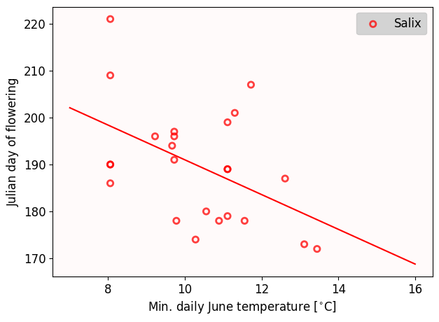
2.5 Visualizing best-fit lines (2nd method)
Remember from College Algebra that all we need to draw a line is an coordinate where the line goes through and its slope. We indeed have that information and we can use the ax.axline plot function.
Note: The plots from (2.4) and (2.5) might look different at first but this is just due to different aspect ratios. Check the x-axis.
# Method #2: Best-fit line

# This is the same code as in (2.1)
fig, ax = plt.subplots(figsize=(7,5))
ax.set_facecolor('snow')
ax.scatter(temp, salix, marker='o', ec='r', fc='none', lw=2, alpha=0.75, label='Salix')
ax.legend(loc='upper right', fontsize=fontsize, facecolor='lightgray', framealpha=1)
ax.set_ylabel('Julian day of flowering', fontsize=fontsize)
ax.set_xlabel('Min. daily June temperature [$^{\\circ}$C]', fontsize=fontsize)
ax.tick_params(labelsize=fontsize);

# This is how we plot the line
# We have the (x,y) coordinate by predicting the flowering time for temp[0] (the index 0 is an arbitrary choice)
xy1 = (temp[0], temp[0]*regression.slope + regression.intercept)
ax.axline( xy1, slope=regression.slope, c = 'r');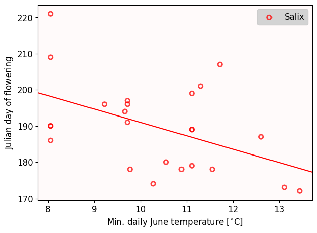
2.5 Making predictions the other way around
We can also make predictions the other way around: What is the required temperature for willow to flower in just 100 days? What sort of weather do we need if we want to delay willow’s flowering to 250 days?
To answer that, we need to invert our linear formula. In this case if , then:
# predictions the other way around
inv_slope = 1/regression.slope
inv_intercept = -regression.intercept/regression.slope

day = 100
t = inv_slope * day + inv_intercept
print('We need a min temperature in June of', round(t,1), 'C, for the willow to flower in ', day, 'days.\n')

day = 250
t = inv_slope * day + inv_intercept
print('We need a min temperature in June of', round(t,1), 'C, for the willow to flower in ', day, 'days.')
We need a min temperature in June of 34.6 C, for the willow to flower in 100 days.
We need a min temperature in June of -5.9 C, for the willow to flower in 250 days.
3. Important mathematical note: order matters
The correlation coefficient of versus is always equal to the correlation coefficient of versus . However, the inverted best-fit line for versus is different from the best-fit line for versus .
✅ Task 4
Compute the best-fit line for temperature versus flowering day. That is, swap the and axis. Complete the code below.
Draw the best fit line for temperature versus flowering day when computed using
inv_slopeandinv_interceptOverlay the best fit line for temperature versus flowering day, but this time computed with
stats.linregress(salix, temp)instead.Make sure you use the dot
.and name to access theselinregressvalues. Do NOT use indices.
# Finish the code
# This is ALMOST the same code as in (2.1)
fig, ax = plt.subplots(figsize=(7,5))
ax.set_facecolor('snow')
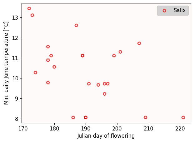
ax.scatter(salix, temp, marker='o', ec='r', fc='none', lw=2, alpha=0.75, label='Salix') # y and x arrays have been swapped
ax.legend(loc='upper right', fontsize=fontsize, facecolor='lightgray', framealpha=1)
ax.set_xlabel('Julian day of flowering', fontsize=fontsize)
ax.set_ylabel('Min. daily June temperature [$^{\\circ}$C]', fontsize=fontsize)
ax.tick_params(labelsize=fontsize);
# plot the best-fit line for temperature versus flowering
# use inv_slope and inv_intercept
# plot the best-fit line for temperature versus flowering
# but this time use stats.linregress(salix, temp)
Are you surprised the lines are different (quite different actually)?
If you are curious, notice that you cannot simply swap and values in the actual formula for the best-fit line slope and get the same result.
Moral of the story: What you define as dependent and independent variables matter
Congratulations, you’re done!
Submit this assignment by uploading it to the course Canvas web page. Go to the “Pre-class assignments” folder, find the appropriate submission folder link, and upload it there.
See you in class!
© Copyright 2026, Division of Plant Science & Technology—University of Missouri
- Kettenbach, J. A., Miller‐Struttmann, N., Moffett, Z., & Galen, C. (2017). How shrub encroachment under climate change could threaten pollination services for alpine wildflowers: A case study using the alpine skypilot,Polemonium viscosum. Ecology and Evolution, 7(17), 6963–6971. 10.1002/ece3.3272