✅ Put your name here
Introduction to p-values, correlation coefficients, and SciPy.
Credits: National Geographic
Learning goals for today’s pre-class assignment
Describe the meaning of a p-value and its correct statistical interpretation
Know how to compute the Pearson correlation coefficient between two measurements
Know how to compute the Spearman correlation coefficient and how it differs from Pearson’s.
Be able to interpret this coefficient and its associated p-value
Assignment instructions
This assignment is due by 11:59 p.m. the day before class, and should be uploaded into the appropriate “Pre-class assignments” submission folder. If you run into issues with your code, make sure to use Teams to help each other out and receive some assistance from the instructors. Submission instructions can be found at the end of the notebook.
1. p-values: What they are and how to interpret them
If you have read any research paper before, there is a good chance that you read a claim along the lines of “the p-value is less than 0.05, supporting our hypothesis.” But what is a p-value to begin with? They are commonly misunderstood and misused, to the point that the ASA—American Statistical Association, the most prominent society for statistical research—has advocated the general public to refrain from using p-values anymore. Or at the very least, to consider alternatives and additional tools.
Q: Why do colleges and grad schools teach ?
A: Because that's still what the scientific community and journal editors use.
Q: Why do scientists and editors use ?
A: Because that's what they were taught in college or grad school.
George Cobb, Professor Emeritus of Mathematics and Statistics at Mount Holyoke College
As a budding data scientist, it is crucial that you understand the true meaning of a p-value, what it does, and equally important, what it does not do.
Watch the following video on p-values.
Note: From here onward, I will be referring to videos from StatQuest which I personally find them very informative and entertaining. You are encouraged to check more.
from IPython.display import YouTubeVideo
YouTubeVideo("vemZtEM63GY",width=640,height=360)✅ Question 1
In your own words describe what is the meaning of a p-value
✎ Put your answer here.
✅ Question 2
Following Prof. Cobb’s (rhetorical) question: what does “p-value less than 0.05” actually mean? Is 0.05 truly that special?
✎ Put your answer here.
✅ Question 3
Following StatQuest’s example, say you are testing whether a new drug A has any adverse effects or not. You run extensive clinical trials. You make sure to take into account biological and social differences across patients. You make sure that all the patients take the right dose. You make sure that the experiment is as controlled as possible.
Then you statistically test if the new drug will not land patients in the ER.
The associated p-value to this test is 0.04. Hooray! so the drug can be safely distributed to patients.
Do you agree with the last statement above?
✎ Put your answer here.
2. Pearson’s correlation coefficient
Back in the in-class 10 (allometry) you may remember that we observed that log body mass and log bone circumference follow a nice linear pattern. This suggests that both measurements are correlated.
We are going to explore how to quantify these sort of correlations. There are many ways to measure correlation, but we are going to use the Pearson Correlation Coefficient (also referred to as “r”, “rho”, “”, or “correlation coefficient”). The Pearson Correlation Coefficient ranges from -1 to 1 and provides a measure of how linearly dependent on one another your variables are.
If the correlation coefficient is close to 1 or -1, then the correlation is strong
If it is close to zero, the correlation is weak or nonexistent.
Also:
If the the correlation coefficient is negative, then the values decrease as increases.
If the correlation coefficient is positive, then the values increase as increases.
For either of the two cases, we say that the relationship between and is monotonic.
See the image below for a visualization of this!
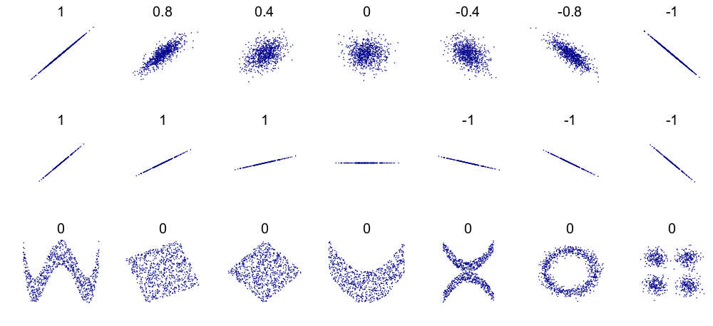
Credits: Wikipedia
Watch the StatQuest on correlation. Ignore the reference to the covariance video.
You don’t need to worry much about the actual formulas to compute Pearson’s correlation (presented after the 13:55 mark): Python will do that for us.
However, do watch his final point on correlation interpretation (starting after the 16:30 mark): we will explore in the next class.
YouTubeVideo("xZ_z8KWkhXE",width=640,height=360)✅ Question 4
How would you explain Pearson’s correlation to a peer of yours that is not taking this course?
✎ Put your answer here.
✅ Question 5
Say you are exploring the correlation in expression values between gene X and gene Y, and between gene X and gene Z.
Between gene X and gene Y, you have a correlation value of 0.4 and a p-value of 0.01
Between gene X and gene Z, you have a correlation value of 0.2 and a p-value of 0.000001
Which pair of genes is the more correlated? Explain your reasoning.
✎ Put your answer here.
3. Spearman’s correlation coefficient

Credits: StatistikGuru.de
So far we have discussed a way to assess if two variables are correlated linearly. But not all correlations are linear. Check the example above: points are clearly correlated but they do not follow a line. Pearson’s coeficcient will fail to fully account this correlation. Another example is allometry case from Day 10, we have a non-linear relationship between body mass and femur circumference:
Log-transforming the formula above makes it linear, so we can use Pearson’s coefficient.
But that’s not always the case. Sometimes we simply cannot transform a non-linear relationship into a linear one. That’s where Spearman’s correlation comes into a play: a way to assess correlation even if the variables do not necessarily follow a line.
Note: If two variables follow a line closely, they will have both high Pearson and Spearman correlation coefficients.
Watch this video (just the first two minutes) for a better description of Spearman. Like with StatQuest, do not focus on the formulas.
YouTubeVideo("XV_W1w4Nwoc",width=640, height=360, end=2*60+2) ✅ Question 6
How does the Spearman coefficient differs from Pearson’s?
✎ Put your answer here.
✅ Question 7
Say that you are assessing whether Gene X and Gene Y are correlated. You compute both Pearson and Spearman correlation coefficients.
Fill in the table below describing what might be going on in each case. Assume that the p-values are small in every case. Don’t overthink it and leave blank if you are not immediately sure.
✎ Edit the table. The pipe symbols | do NOT need to align
| Pearson’s Coefficient is low | Pearson’s Coefficient is high | |
|---|---|---|
| Spearman’s Coefficient is low | ||
| Spearman’s Coefficient is high |
4. Anscombe’s quartet or the importance of plotting your data
As Wikipedia states:
Anscombe’s quartet comprises four datasets that have nearly identical simple descriptive statistics, yet have very different distributions and appear very different when graphed. These were constructed by Francis Anscombe to demonstrate both the importance of graphing data when analyzing it, and the effect of outliers and other influential observations on statistical properties.
He described the article as being intended to counter the impression among statisticians that “numerical calculations are exact, but graphs are rough”.
Below are the plots of the four Anscombe’s datasets in blue, with the best-fit line in red. Don’t worry much about the code.
# Code adapted from https://matplotlib.org/stable/gallery/specialty_plots/anscombe.html
# Don't worry much about this code at the moment
import matplotlib.pyplot as plt
import numpy as np
from scipy import stats

# The actual Anscombe's values
x = [10, 8, 13, 9, 11, 14, 6, 4, 12, 7, 5]
y1 = [8.04, 6.95, 7.58, 8.81, 8.33, 9.96, 7.24, 4.26, 10.84, 4.82, 5.68]
y2 = [9.14, 8.14, 8.74, 8.77, 9.26, 8.10, 6.13, 3.10, 9.13, 7.26, 4.74]
y3 = [7.46, 6.77, 12.74, 7.11, 7.81, 8.84, 6.08, 5.39, 8.15, 6.42, 5.73]
x4 = [8, 8, 8, 8, 8, 8, 8, 19, 8, 8, 8]
y4 = [6.58, 5.76, 7.71, 8.84, 8.47, 7.04, 5.25, 12.50, 5.56, 7.91, 6.89]

datasets = [ [x, y1], [x, y2], [x, y3], [x4, y4] ]

bbox = dict(boxstyle='round', fc='blanchedalmond', ec='orange', alpha=0.5)
fig, ax = plt.subplots(1, len(datasets), sharex=True, sharey=True, figsize=(12, 2.75) )

for i in range(len(ax)):
    ax[i].set_facecolor('snow')
    ax[i].text(0.1, 0.9, f'{i+1}', fontsize=20, transform=ax[i].transAxes, va='top')
    ax[i].tick_params(bottom=True, labelbottom=False, left=True, labelleft=False)
    ax[i].scatter(*datasets[i], marker='o', c='b')

    # linear regression --- we'll see more of this next week
    linregress = stats.linregress(*datasets[i])
    ax[i].axline(xy1=(0, linregress.intercept), slope=linregress.slope, color='r', lw=2)

    # add text box for the statistics
    infobox = (f'$\\mu$ = {np.mean(datasets[i][1]):.2f}\n'
               f'$\\sigma$ = {np.std(datasets[i][1]):.2f}\n'
               f'$r$ = {stats.pearsonr(*datasets[i]).statistic:.2f}\n'
               f'$s$ = {stats.spearmanr(*datasets[i]).statistic:.2f}')
    ax[i].text(0.97, 0.04, infobox, fontsize=11, bbox=bbox, transform=ax[i].transAxes, ha='right')
fig.suptitle("Anscombe's Quartet", fontsize=20)
fig.tight_layout();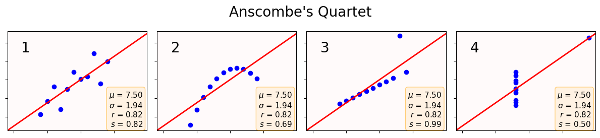
✅ Question 8
For all four datasets, the information box states their Pearson’s () and Spearman’s () correlation coefficient.
Does a high Pearson’s correlation always correspond to a linear relationship?
When do Pearson’s and Spearman’s coincide the most? When do they differ the most?
Do you feel more confident to answer the table in Q7? If so, add any new answers in Q7.
✎ Put your answer here.
✅ Question 9
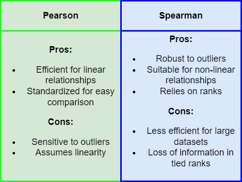
Credits: Riccardo Andreoni
Based on Anscombe’s quarted and the pros and cons table above.
Describe one example where using Pearson would be preferable over Spearman.
Describe another example where Spearman is preferred over Pearson. Can you think of a scenario where data is linearly correlated and yet Spearman would be preferred?
✎ Put your answer here.
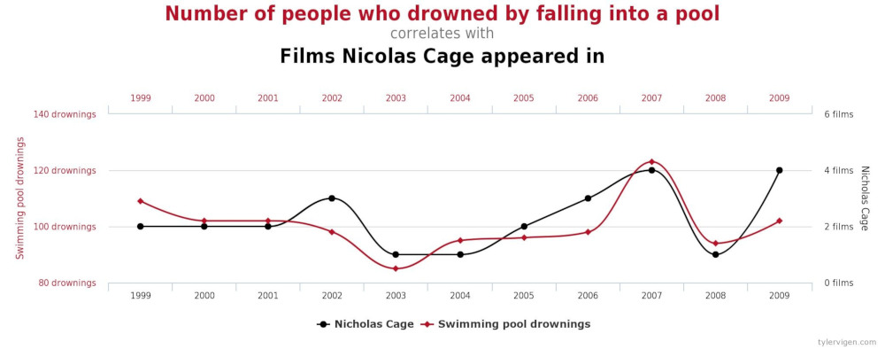
5. Correlation is NOT causation
Before we end, it is important to emphasize that while causation implies correlation, the opposite is not necessarily true.
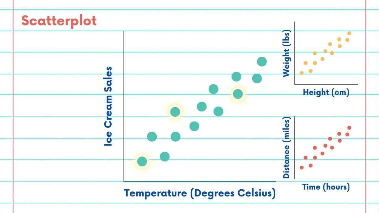
Credits: North East Big Data Innovation Hub
For example, we know that if we grow taller, that will cause an increase in weight. By driving a longer time we will cause a longer traveled distance. An increase in temperature will likely cause an increase in ice cream sales. And not surprisingly, we will find that each of those three pairs of variables are highly correlated.
But we can have highly correlated variables that despite their large coefficients, we know that it is nonsensical to attribute causation. This is known as spurious correlations. Like comparing the popularity of memes vs number of electrical engineers () or number of people named Alix vs carjacks (). p-values are quite small in both cases.
In other words: correlation coefficients and p-values can only take us so far. Even more general: data science can only take us so far; domain knowledge is crucial to make sense of the results.
✅ Task 9
Look for “spurious correlations” on the internet and list three that you find particularly funny/interesting.
Remember that in markdown, you can embed an image from the internet by doing
Example of embedded image

Additional reading (optional)
You can read more about spurious correlations in an article from National Geographic a few years ago. A PDF copy is attached in Canvas if you have trouble accessing the URL.
Congratulations, you’re done!
Submit this assignment by uploading it to the course Canvas web page. Go to the “Pre-class assignments” folder, find the appropriate submission folder link, and upload it there.
See you in class!
© Copyright 2026, Division of Plant Science & Technology—University of Missouri
- Wasserstein, R. L., & Lazar, N. A. (2016). The ASA Statement on p -Values: Context, Process, and Purpose. The American Statistician, 70(2), 129–133. 10.1080/00031305.2016.1154108