Grow switchgrass anywhere with this neat hack
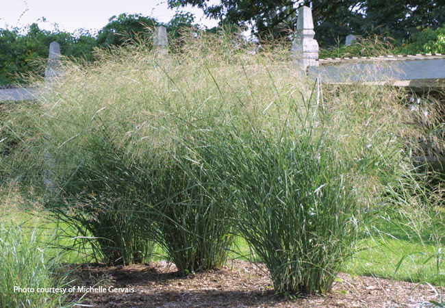
Credits: Garden Gate magazine
Learning goals of today’s assignment
Use
statsto compute Welch’s t-tests and realize they are a much better alternative than Student’s t-testsNotice that different comparison tests can result in very different conclusions
Realize that it is possible to conclude that a difference is both significant and not significant
Assignment instructions
Work with your group to complete this assignment. Instructions for submitting this assignment are at the end of the Notebook. The assignment is due at the end of class.
Importing the modules that we will need
Before we start anything, it is good practice to have all our imports as the first Python cell
import numpy as np
import matplotlib.pyplot as plt
import pandas as pd
from scipy import stats
from sklearn import metrics
1. Switchgrass, revisited
In the pre-class Notebook we re-explored the switchgrass yield data from Ricketts et al (2023). We will keep exploring the question
When growing switchgrass in Missouri, do different switchgrass cultivars yield different biomasses?
We first load and wrangle the
'HARVEST.tsv'file
# Repeating pre-class

data = pd.read_csv('HARVEST.tsv', sep='\t')
data.head()Get only data corresponding to Missouri
We will use only this sub-dataset for the rest of the assignment.
site = 'MO'
df = data[ data['SITE'] == site ]
df.head()2. Q-Q plots and normality plots
Before making any comparisons, we should check whether the yield data are normal-ish or not. We then do some Q-Q plots to check if the quantiles of our data follow the same quantiles of a theoretical normal distribution.
2.1 Start with one cultivar: Carthage
Before doing a big plot with all sorts of Q-Qs at once, let’s make sure how things work for a single cultivar. We can then just put it in a loop and do the rest.
✅ Task 1
Make a NumPy
quantilesarray of values between 0.1 and 0.9. We choose because it is comparable to our switchgrass sample size ().Get a Series with only the Carthage yield data and compute its quantiles (the ones from
quantiles).
# Your code

# A Series of MO Carthage yield values

# quantiles = 0.1 .. 0.9
# qdata = np.quantiles( MO Carthage yield values , ... )
✅ Task 2
Get the mean and standard deviation of Carthage yield
With the
stats.norm.ppffunction, compute thequantilesof a normal with mean and SD of Carthage (locandscale, respectively)
Hint: Just like with np.quantiles, the quantiles for .ppf can be passed as an array.
# Your code

# qnormal = stats.norm.ppf ( ... )
✅ Task 3
Now do a Q-Q scatterplot: theoretical quantiles (T2) vs data quantiles (T1)
With
axlinedraw an identity line ().The identity line has points of the form
(x, x): for example,(qdata[0], qdata[0]).The identity line has slope
= 1
# Finish the plot

fig, ax = plt.subplots(1,1, figsize=(4,4), sharex=False, sharey=True)
ax = np.atleast_1d(ax)
ax[0].set_facecolor('snow')

# Q-Q plot

fig.tight_layout()
✅ Question 4
Based on the Q-Q plot alone, do you think the Carthage data is normally distributed?
Note: Your points will almost never fall in a perfect diagonal line, even when perfectly normal. But they are reasonably close to the identity line. Take a look at section 4.4.1 here which shows various Q-Q plots drawn from actual normal distributions.
✎ Put your answer
2.2 Put everything on a loop
✅ Task 5
Finish the loop, now repeating the plot from T6 but for all six cultivars at once
Make sure you have an identity line in each subplot
Add a title to each subplot so you know which cultivar is which plot
# Finish the code

genos = ['Alamo', 'Kanlow', 'Carthage', 'Liberty', 'CIR', 'Blackwell']

fig, ax = plt.subplots(1, len(genos), figsize=(3*len(genos), 3.5), sharex=False, sharey=False)
for i in range(len(genos)):

    ax[i].set_facecolor('snow')
    # Q-Q plots

fig.tight_layout()
✅ Question 6
Based on the Q-Q plots alone, do you think the yield data in general are normal-ish distributed?
Put another way: do the points deviate significantly from the identity line? If you keep scrolling here, you’ll see Q-Q plots that are NOT normal.
✎ Put your answer
✅ Question 7
Do you think it makes sense to compare yield data with Welch’s test?
✎ Put your answer
3. Two-sample tests and p-value adjustment
The data seems reasonably normal-ish to go with Welch’s.
✅ Question 8
Say you perform a Welch’s test between Carthage and Alamo.
In switchgrass yield terms, what is the null hypothesis being tested by Welch’s in such case?
✎ Put your answer
✅ Task 9: Code Tinkering
With data from , check which cultivars yield the same biomass when grown in Missouri.
Use Welch’s t-tests to compare every cultivar against each other.
Make sure you don’t compare a cultivar against itself.
Store your p-values as a Series, where the indices keep track of what two cultivars you’re comparing.
# Tinker the code from the pre-Class
'''
# Do a Mann-Whitney U-test between every pair of cultivars in Missouri

site = 'MO'

# Get a subDataFrame with just the Missouri data
df = data[data['SITE'] == site]
pvals = pd.Series()

for i in range(len(genos) - 1):
    # Just the yield data for one cultivar
    yi = df.loc[df['GENO'] == genos[i], 'BIOMASS_AVG_Mg_ha']

    for j in range(i+1, len(genos)):

        # Yield data for another cultivar
        yj = df.loc[df['GENO'] == genos[j], 'BIOMASS_AVG_Mg_ha']

        # Mann-Whitney U-test
        utest = stats.mannwhitneyu(yi, yj)

        pvals.loc[genos[i]+' vs '+genos[j]] = utest.pvalue
pvals
'''
"\n# Do a Mann-Whitney U-test between every pair of cultivars in Missouri\n\nsite = 'MO'\n\n# Get a subDataFrame with just the Missouri data\ndf = data[data['SITE'] == site]\npvals = pd.Series()\n\nfor i in range(len(genos) - 1):\n # Just the yield data for one cultivar\n yi = df.loc[df['GENO'] == genos[i], 'BIOMASS_AVG_Mg_ha']\n\n for j in range(i+1, len(genos)):\n\n # Yield data for another cultivar\n yj = df.loc[df['GENO'] == genos[j], 'BIOMASS_AVG_Mg_ha']\n\n # Mann-Whitney U-test\n utest = stats.mannwhitneyu(yi, yj)\n\n pvals.loc[genos[i]+' vs '+genos[j]] = utest.pvalue\npvals\n"✅ Task 10
Just like last time, before calling it a day, we must adjust these p-values for false positives.
Perform a Benjamini-Hochberg adjustment to the p-values from T9 with
stats.false_discovery_control.Put the results in a Series so you still can track what p-value goes with which cultivars
# Your code✅ Question 11
Make sure you discuss this with your group:
Based on your Welch’s adjusted p-values, are the yields of Carthage and Blackwell different?
But how do your conclusions compare when you did Mann-Whitney for the pre-class (if you did not do the pre-class, just run all the cells and check the output of Part 3)?
Which is the right call?
✎ Put your answer
4. When in doubt, visualize (actually, always visualize)
Below is a jitterplot with the actual yield data for all the years and all the cultivars in Missouri. We also draw the 95% confidence intervals.
fs = 12
rng = np.random.default_rng(42)
nudge = rng.uniform(-0.15,.15, 1000)

colors = ['r', 'orange', 'forestgreen', 'palegreen', 'royalblue', 'blueviolet']
markers = ['o','^','v','s','D','>']

# The actual plot
fig, ax = plt.subplots(1,1,figsize=(5,4), sharex=True, sharey=True)
ax = np.atleast_1d(ax)
i = 0
ax[i].set_title(site, fontsize=fs)
ax[i].set_facecolor('snow')
ax[i].grid(zorder= 1)
ax[i].set_xticks(range(len(genos)), genos, fontsize=fs, rotation=15, va='center_baseline')

for j in range(len(genos)):
    yi = df.loc[df['GENO'] == genos[j], 'BIOMASS_AVG_Mg_ha']
    ci = stats.t.ppf(0.975, len(yi)-1)*yi.sem()

    ax[i].scatter(j + nudge[:len(yi)], yi, c=colors[j], marker=markers[j], alpha=0.6, ec='gray', lw=0.5, zorder=3)
    ax[i].errorbar(j, yi.mean(), yerr=ci, color='k', mew=1.5, elinewidth=1.5, capsize=5, mfc='w', marker='D', zorder=3)

fig.supylabel('Biomass yield [Mg/ha]', fontsize=fs)
fig.tight_layout();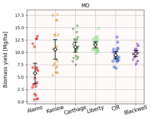
✅ Question 11
Look at the p-values between Alamo and Liberty: do they match your visuals?
What about Kanlow vs Carthage?
Remember your rule of thumb regarding significant p-values and overlaps between confidence intervals.
✎ Put your answer
✅ Question 12
What about Carthage vs Blackwell? Does the visualization change your answer from Q10?
✎ Put your answer
✅ Question 13
Take a step back: Are we going to ignore all our domain knowledge in favor of a single p-value?
What else could you do to break the impasse to decide if Carthage and Blackwell are truly different or not?
✎ Put your answer
5. To hack or not to hack
As you see, without the need of any cherry-picking—or any other irresponsible practices—we can construct a story in such a way that the yield from Carthage and Blackwell is statistically similar. We can also construct a story where these yields are statistically different.
We can p-hack! We can just report the test that reflects what we want!
If your research or graduation depends on proving the superiority of Carthage over Blackwell—or the other way around—you can see that our personal bias can influence which story we choose.
Mann-Whitney’s U-test has a p-value of 0.08, which we deem not significant → both cultivars have similar yields
Welch’s t-test has a p-value of 0.04, which we deem significant → both cultivars have different yields
But this deeming as significant affair is arbitrarily based on 0.05.
✅ Question 14
We can say from the get-go: we will only consider p-values below 0.01 as significant. That way, Blackwell vs Carthage is non-significant either way. No impasse.
But changing the significance level from 0.05 level is not a silver bullet.
Can you think of ways we can also hack by moving the significance threshold?
What about saying that Blackwell vs Carthage is “borderline significant”, with a p-value of 0.08 and we let the rest of scientific readers decide if 0.08 is small enough or not.
Either way, you should provide a data visualization to let readers decide by themselves.
✎ Put your answer
Congratulations, you’re done!
Submit this assignment by uploading it to the course Canvas web page. Go to the “In-class assignments” folder, find the appropriate submission link, and upload it there.
See you next class!
© Copyright 2026, Division of Plant Science & Technology—University of Missouri
- Ricketts, M. P., Heckman, R. W., Fay, P. A., Matamala, R., Jastrow, J. D., Fritschi, F. B., Bonnette, J., & Juenger, T. E. (2023). Local adaptation of switchgrass drives trait relations to yield and differential responses to climate and soil environments. GCB Bioenergy, 15(5), 680–696. 10.1111/gcbb.13046