Lists, loops, and growing saguaros
Credits: Battle Map Studio
Learning goals for today’s assignment
Practice how lists and loops can help us plot data
Understand what makes a plot useful (and hence the importance of good data viz) by making an ugly plot.
Assignment instructions
Work with your group to complete this assignment. Instructions for submitting this assignment are at the end of the Notebook. The assignment is due at the end of class.
Background
Today we will use data on seventy-five years of mortality and regeneration research in the saguaro cactus population at Saguaro National Park. Notably, mortality rates are age-dependent, with older saguaros showing higher death rates, particularly after environmental stressors like the 2011 freeze. The research emphasizes the importance of long-term monitoring to understand the effects of human and environmental factors on this long-lived species. Importantly, cacti are analyzed based on their height class or height type:
Class I: 0.0–1.8 m (0 – 5’11")
Class II: 1.8–3.7 m (5’11" – 12’8")
Class III: 3.7–5.5 m (12’8" – 18’1")
Class IV: 5.5–7.3 m (18’1" – 23’11")
Class V: >7.3 m (> 24’)
More details can be found in the original manuscript:
Orum TV, Ferguson N, Mihail JD (2016) Saguaro (Carnegiea gigantea) Mortality and Population Regeneration in the Cactus Forest of Saguaro National Park: Seventy-Five Years and Counting. PLOS ONE 11(8), e0160899.
Note: We’ll refer to the paper above simply as “Orum et al (2016)”.
1. Height and survival probability in saguaro cacti
Let’s take a look at Figure 7 from Orum et al (2016) and the story it conveys
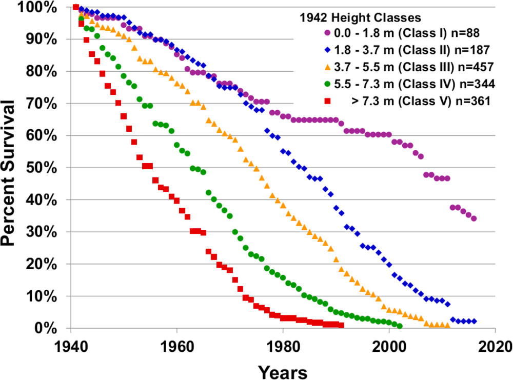
Credits: Orum et al (2016)
✅ Task 1: Understanding the story
What is reflected on the x-axis?
What is reflected on the y-axis?
What do different colors/markers represent?
In your own words, what information do you get out of this figure?
✎ Put your answer here
✅ Task 2: Understanding the data
Now let’s take a look at the raw data itself.
In Excel, open the file
HeightClasses_1941_to_2016_Survivorship.csv(attached in Canvas)What are the rows? What are the columns?
Do you think that that is all the data we need to replicate the figure?
✎ Put your answer here
2. Reproducing the results
Now let’s try to replicate the data analysis and viz from Orum et al. Make sure you have downloaded the HeightClasses_1941_to_2016_Survivorship.csv file from Canvas and placed it in the same place as this Notebook.
# Just run these Python cells
# We'll discuss more about what they do later in the semester

import matplotlib.pyplot as plt
import pandas as pd
# Just run these Python cells
# We'll discuss more about what they do later in the semester
filename = 'HeightClasses_1941_to_2016_Survivorship.csv'
df = pd.read_csv(filename, index_col=0)
counts_ht1, counts_ht2, counts_ht3, counts_ht4, counts_ht5 = [ df.iloc[:,i].tolist() for i in range(df.shape[1]) ]After running the two cells above, we have 5 lists, one per height class (height type). These contain the number of observed surviving saguaro cacti according to their height type, from years 1941 to 2016. One list entry per year.
✅ Task 3: A list for all years
We first need a list containing all years between 1941 and 2016. That is, a list that looks like: [1941, 1942, ..., 2016].
In the cell below, create an empty list
yearsUse code similar to the one you used for Task 2 from the pre-class to fill in the
yearslist with a loop. That is, instead of doingprintinside the loop, you’ll do.append.Finally, print the length of
years. It should have 76 values.
Remember: For the range(start, stop) function, you can specify where it starts and where it ends. Remember that its last value will be actually stop - 1.
# Make a list with year numbers 1941 to 2016✅ Task 4: Survival percentages
You probably noticed that the data contains the actual number count of surviving cacti, but Figure 7 shows surviving percentage. For each of the height types, the survival percentage for any year XXXX is:
Using the appropriate index, print the number of counted cacti of height type 1 in year 1941.
# Print the counting value for year 1941
# Remember that list `counts_ht1` has the counts for saguaros of class I
✅ Task 4 (continued)
Make an empty list
percent_ht1With a loop, fill this new list with the survival percentages of saguaros of height type 1. This is similar to what you did for Task 8 in the pre-class.
# Get survival percentage instead of counts✅ Task 5: Plotting the results
Simply run the cell below to generate a plot of percent survival vs year. In the next few weeks we will delve into matplotlib to understand how to actually make plots in Python.
Does your results match the ones presented in the original paper?
# Just run this cell to visualize your results
fig, ax = plt.subplots(1,1, figsize=(5,4))

# This is to make the plot look like the one from the original paper
ax.set_ylabel('Percent Survival')
ax.set_xlabel('Year')
ax.set_xlim(1940,2020)
ax.set_ylim(0,100)
ax.set_yticks(range(0,101,10))
ax.set_xticks(range(1940,2021,20))
ax.grid(axis='y', which='both', zorder=1)

# This line is the important one: it plots the values in your lists
ax.scatter(years, percent_ht1, color='purple', marker='o');
---------------------------------------------------------------------------
NameError Traceback (most recent call last)
Cell In[6], line 14
11 ax.grid(axis='y', which='both', zorder=1)
13 # This line is the important one: it plots the values in your lists
---> 14 ax.scatter(years, percent_ht1, color='purple', marker='o');
NameError: name 'years' is not defined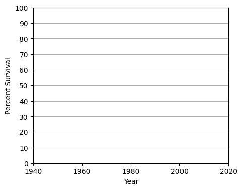
✅ Task 6: Getting the rest of the height types
Copy/paste four times your code from Task 4
Edit accordingly each of the copies to compute survival percentages for the rest of the four saguaro height types (
percent_ht2,percent_ht3, etc.)Be careful to not overwrite any important variables.
# Copy/paste and edit code from Task 4
✅ Task 6 (continued)
Now plot your results. Notice that below is a copy/paste of the code from Task 5.
You just need to add four
ax.scatter()lines at the bottom, where you changepercent_ht1for each of the height types.Edit the marker type (
marker =) and its color (color =) so that it matches as much as possible with the original.Does your trends match the original Figure 7 from Orum et al (2016)?
# These lines are exactly the same as in Task 5
# No need to change these
fig, ax = plt.subplots(1,1, figsize=(5,4))
ax.set_ylabel('Percent Survival')
ax.set_xlabel('Year')
ax.set_xlim(1940,2020)
ax.set_ylim(0,100)
ax.set_yticks(range(0,101,10))
ax.set_xticks(range(1940,2021,20))
ax.grid(axis='y', which='both', zorder=1)

# ADD EXTRA LINES HERE
ax.scatter(years, percent_ht1, color='purple', marker='o');
---------------------------------------------------------------------------
NameError Traceback (most recent call last)
Cell In[8], line 13
10 ax.grid(axis='y', which='both', zorder=1)
12 # ADD EXTRA LINES HERE
---> 13 ax.scatter(years, percent_ht1, color='purple', marker='o');
NameError: name 'years' is not defined✅ Task 7: Lists, loops, and plots (time-permitting)
We can combine lists and loops to make edits easier. Instead of copy/pasting and editing severalax.scatter lines, we can define lists with data, colors, and marker types, and then loop through them. All while having a single ax.scatter statement. In fact, that is what we did when plotting the Gateway Arch visitor data last week!
Ultimately, you should get pretty much the same plot as in Task 6.
Remember that a list can contain anything, even lists!
Make a list
color_listcontaining string variables corresponding to the colors of the five different saguaro height types.Make a list
marker_listcontaining string variables corresponding to the marker types of the five different saguaro height types.Make a list
percent_survivalcontaining lists:percent_ht1,percent_ht2, ... ,percent_ht5Note: Each of these three lists should have 5 items
Have a loop (accessing through indices) so that there is a single
ax.scatterline to plot all five saguaro height types.
Hint: Refer to the code of Day 01 In-Class
# Fill in the lists with strings of colors
color_list = []

# Fill in the list with string of markers
marker_list = []

# Fill in the list with your percent_ht lists. List-ception!
percent_survival = []

# These lines are exactly the same as in Task 5. No need to change these
fig, ax = plt.subplots(1,1, figsize=(5,4))
ax.set_ylabel('Percent Survival')
ax.set_xlabel('Year')
ax.set_xlim(1940,2020)
ax.set_ylim(0,100)
ax.set_yticks(range(0,101,10))
ax.set_xticks(range(1940,2021,20))
ax.grid(axis='y', which='both', zorder=1)

# Loop through the percent_survival list USING indices:
     # ax.scatter( years , ???, color= ???, marker = ???)
✅ Question
Do you see any advantages of doing writing out the code as in Task 7 compared to the code in Task 6? What if the data was split into 20 saguaro types instead of just 5?
✎ Your answer
✅ Question
Why do you think the original research authors plot percentages instead of the actual count values?
✎ Your answer
Congratulations, you’re done!
Submit this assignment by uploading it to the course Canvas web page. Go to the “Assignments” folder, find the appropriate submission folder link, and upload it there.
See you in class!
© Copyright 2026, Division of Plant Science & Technology—University of Missouri
- Orum, T. V., Ferguson, N., & Mihail, J. D. (2016). Saguaro (Carnegiea gigantea) Mortality and Population Regeneration in the Cactus Forest of Saguaro National Park: Seventy-Five Years and Counting. PLOS ONE, 11(8), e0160899. 10.1371/journal.pone.0160899