✅ Put your name here.
✅ Put your group member names here.
Can we estimate an animal’s total body weight looking just at its femur?
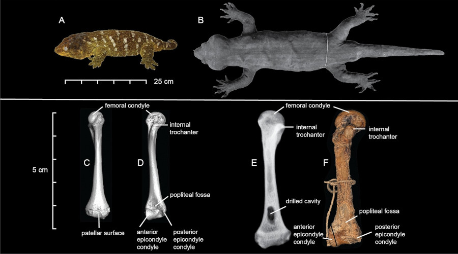
Credits: Heinicke et al (2023)
In this assignment you’re going to work to visualize allometric relationships. This should give you a good foundation for modeling some of our future projects!
Learning goals for today’s assignment
Use the
numpymodule in Python to compute values that can be used in computational models for real-world phenomena.Use
matplotlibto visualize your models.Customize
matplotlibplots to maximize the information they provide.
Assignment instructions
Work with your group to complete this assignment. Instructions for submitting this assignment are at the end of the Notebook. The assignment is due at the end of class.
✅ Question:
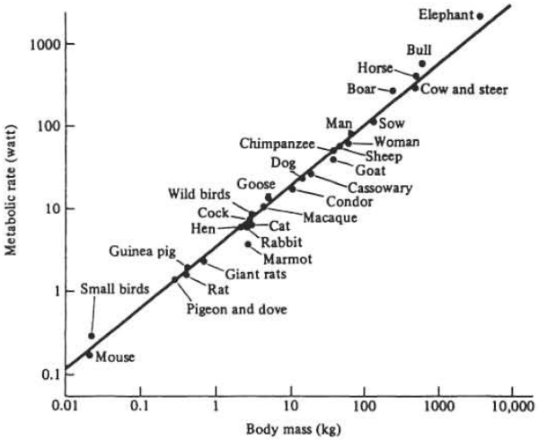
What information can you extract from the graph above?
Metabolism is a quite complex biochemical process, and yet it appears that we only need body mass to approximate it. Do you think this is mere coincidence or that there might be more to it?
What do you notice about the scale of the x,y-axes?
✎ Write your plan here
Crash course in the importance of scale
Allometry is the study of how the size of one part of an organism changes in relation to the size of the whole organism or another part as the organism grows. In other words, it looks at proportional growth. For example:
If a baby animal grows into an adult, its legs, head, and body don't all grow at the same rate. Some parts grow faster or slower than others.
Think about you as baby: your head looked huge compared to the rest of your body! But as you grew, your body caught up. That's allometry in action.
Mathematically, allometry often uses a power law relationship:
Where:
= one measurement (lengths, heights, mass, etc.)
= another body part measurement
= constant
= scaling exponent (tells you if growth is proportional or not)
In the plot above, we have Metabolic Rate, and Body Mass.
1. Total animal weight based on femurs
Say we want to estimate an animal’s body mass based on its femur circumference. In paleontology, this is one of the very few measurments you have access to. Allometrically, it means that there is an equation
1.1 Plan out your code: Calculating weight
✅ Task 1:
As a group, design a function called power_law. Its inputs should be:
A constant
A scaling exponent
A list of femur circumferences
It should return a list of the corresponding weight values for each femur in the list that was passed.
You and your groups members are expected to work this out together.
Things to think about:
how will you convert the math from the equations above into code?
How will you calculate the weight for every time value in the list that was passed?
How will you return the weight values?
✎ Write your plan here
1.2 Translate your plan into code: Calculating Populations
✅ Task 2:
Translate your plan from the previous problem into a function that calculates the total population for a given set of initial inputs.
Work with your group to figure this out!
# Put your code here to define a power law function1.3 Testing your code: Calculating Populations
✅ Task 3
Test out your code to see if it is working. Use the following values for your model:
Assume the constant is 0.00035
The scaling exponent is 0.5
The list of femur circumferences goes from 10mm (American red squirrel) to 100mm (blue wildebeest)
Model the animal weight for these inputs and make a plot showing the results.
Work with your group to figure this out!
# The following line creates your initial femur list (technically, it is creating a numpy array, but we won't worry about that for now)

import numpy as np
circumferences = np.arange(10,101)

# Put your code here
1.4 Varying the Parameters: sub- and super-linear growth
Let’s see how the different parameters effect our weight model.
✅ Task 4
Calculate the weight model for all of the same input values as in (1.3) except for the scaling exponent , which will vary:
b_values = [1, 1.5, 2, 3]Put the lines for all four weight models on the same plot. Use plt.legend() to add a legend to the plot so that you know which line is which. You’ll want to use the label parameter in your plot command to make sure the legend has the appropriate labels for the lines.
Make sure to add appropriate axis labels and a plot title.
Work with your group to figure this out!
# The following line creates your initial femur list (technically, it is creating a numpy array, but we won't worry about that for now)
circumferences = np.arange(10,101)

# loop through numbers in the b_values:
    # list of weight values based on the indexed b value
    # plot weights vs femur values; label based on the b value

# plot the legend
# make sure the axes are labeled
✅ Question 5
A Bengal tiger (like Truman) has an average femur circumference of 90.5mm and weights about 145kg. What scaling seems to provide a better model?
Hint: Try adding a
plt.grid()after your plot commands to add a grid to the plot. This can be helpful for seeing where a specific point is.
✎ Put your answer here
✅ Question 6
Can you visually distinguish the model
b = 3fromb = 1(like in Task 3)?Can you visually tell apart
b = 1fromb = 2?
✎ Put your answer here
1.5 Log-transform
You probably realized that most of the models are visually undistinguishable. We can improve this by log-transforming the axes: compute (logarithm base 10) on both sides of the equation:
For allometry, log-transforming has an added advantage. If you recall from College Algebra, the equation above looks almost like that of a line. We just have a pesky exponent. Log-transforming it actually makes it a line:
Note: Any logarithmic base is good as any. But is preferred because it is easier to interpret (it is just about moving the decimal point and counting zeroes).
✅ Task 7
Now, instead of plotting estimated weight versus femur circumference, plot their log-transformed values.
Log-transform the list of femur circumferences and estimated weights
Hint: There is a
numpyfunction for thatHint: The
numpyfunction can take either single values or a whole list at once. In the latter case, it will return a new list.
Make a new plot with these log-transformed lists
Make sure you still include the legend in your plot and that the axes have appropriate labels!
# The following line creates your initial femur list (technically, it is creating a numpy array, but we won't worry about that for now)
# make an array of circumference values
circumferences = np.arange(10,101)

# Put your code here
fig, ax = plt.subplots(1,1,figsize=(6,4))
for b in bs:
    ax.plot(np.log10(circumferences), np.log10(power_law(circumferences, b=b)), label=np.round(b,2))
ax.set_ylabel('Weight')
ax.set_xlabel('Femur circumference')
#ax.set_aspect('equal', 'datalim')
ax.grid()
ax.legend();
---------------------------------------------------------------------------
NameError Traceback (most recent call last)
Cell In[5], line 1
----> 1 fig, ax = plt.subplots(1,1,figsize=(6,4))
2 for b in bs:
3 ax.plot(np.log10(circumferences), np.log10(power_law(circumferences, b=b)), label=np.round(b,2))
NameError: name 'plt' is not defined✅ Question 8
Can you visually distinguish the model
b = 3fromb = 1?Can you visually tell apart
b = 1fromb = 2?
✎ Put your answer here
A SHORT DETOUR: Axes and one or multiple plots in the same figure using subplots()
Credits: Matplotlib Journey
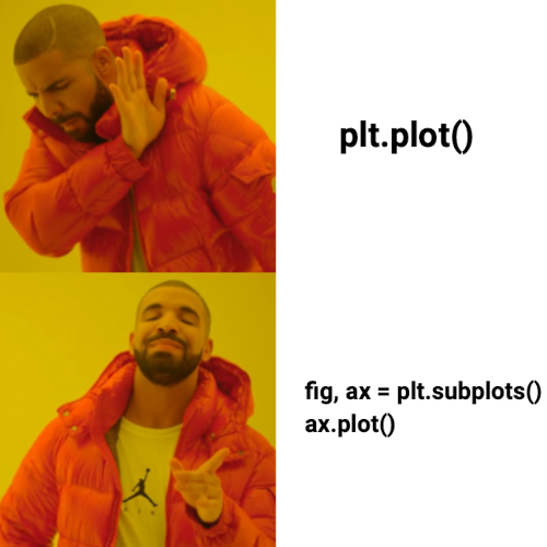
So far you have been using the pyplot interface everytime you do plt.something(). This interface is good when you want a quick plot to make sure your data behaves as you expect. But if you want something more complex—like a plot with multiple subplots—the Axes interface is the way to go! Even if you want a single plot, it better to use Axes.
fig, ax = plt.subplots( figsize=(4,2) )The above command creates and returns a single plot of size 4 x 2 inches. We can re-write the pre-class smiley face with the Axes interface:
# Smile for the Axes interface
import matplotlib.pyplot as plt

x1 = [2,4,6,8,10,12,14,16,18]
y1 = [10,8.25,7.5,7,6.75,7,7.5,8.25,10]

x2 = [5, 15]
y2 = [15, 15]

fig, ax = plt.subplots(figsize=(4,2))

ax.plot(x1, y1, color='b', ls='dashed', lw=5)
ax.scatter(x2, y2, color='r', marker='d')
ax.set_xlim(0,20) # Compare it to plt.xlim
ax.set_ylim(6,16) # Compare it to plt.ylim
ax.set_xlabel("Smile!") # Similarly, plt.xlabel vs ax.set_xlabel
ax.set_ylabel("Don't worry, be happy");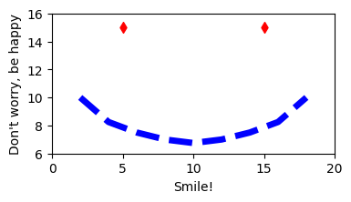
One immediate advantage of the Axes interface is that we can easily have multiple subplots within a larger plot
fig, ax = plt.subplots(2,3, figsize=(12,6), sharey=True, sharex=True )
ax = ax.ravel()
The first line makes a sequence of
2*3 = 6subplots to be arranged into2rows and3columns.We also say that all these subplots will share the same x- and y-axes scales, so they are comparable to each other.
The second line makes this sequence into a list, to be read left to right and top to bottom—like you usually read.
The following bit of code provides an example of how the subplots function can be used. Make sure you read and understand what the code is doing! There’s also a way to summarize code in a loop below!
You may also find this page of subplots examples useful.
import numpy as np

# initialize a NumPy array with 100 values between 0 and 2*pi
# We will discuss more about NumPy next pre-class
x_array = np.linspace(0,2*np.pi,100)

# The cool thing of NumPy is that we can apply a math operation to an array as whole. No need for loops!
# We will discuss more about NumPy next pre-class
y1 = np.sin(x_array)
y2 = np.sin(2*x_array)
y3 = np.sin(3*x_array)
y4 = np.sin(4*x_array)
y5 = np.sin(5*x_array)
y6 = np.sin(6*x_array)

fig, ax = plt.subplots(2,3,figsize=(10,4), sharex=True, sharey=True)
ax = ax.ravel()

fig.suptitle('A bunch of sine plots')  # title for the whole figure

# plot each curve on a separate subplot
ax[0].plot(x_array, y1, color='red') # plot points in the first subplot
ax[0].set_xlabel('x')
ax[0].set_ylabel('y')
ax[0].set_title('y=sin(x)')  # title for 1st subplot

ax[1].plot(x_array, y2, color='blue') # plot points in the second subplot
ax[1].set_xlabel('x')
ax[1].set_ylabel('y')
ax[1].set_title('y=sin(2x)')  # title for 2nd subplot

ax[2].plot(x_array, y3, color='green') # plot points in the third subplot
ax[2].set_xlabel('x')
ax[2].set_ylabel('y')
ax[2].set_title('y=sin(3x)')  # title for 3rd subplot

ax[3].plot(x_array, y4, color='orange') # plot points in the fourth subplot
ax[3].set_xlabel('x')
ax[3].set_ylabel('y')
ax[3].set_title('y=sin(4x)')  # title for 4th subplot

ax[4].plot(x_array, y5, color='black') # plot points in the fifth subplot
ax[4].set_xlabel('x')
ax[4].set_ylabel('y')
ax[4].set_title('y=sin(5x)')  # title for 5th subplot

ax[5].plot(x_array, y6, color='purple') # plot points in the sixth subplot
ax[5].set_xlabel('x')
ax[5].set_ylabel('y')
ax[5].set_title('y=sin(6x)')  # title for 6th subplot

plt.tight_layout()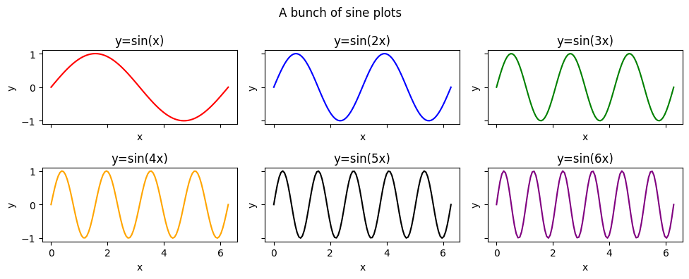
Notice how each of the above six plots are made. Also realize that most of the code was copy/pasted over and over again. We can use a for loop to make our life easier!
# initialize NumPy array and a list of colors
colors = ['red', 'blue', 'green', 'orange', 'black','purple']
x_array = np.linspace(0,2*np.pi,100)

fig, ax = plt.subplots(2,3,figsize=(10,4), sharex=True, sharey=True)
ax = ax.ravel()

fig.suptitle('A bunch of sine plots (made with a loop!)', fontsize=14)  # title for the whole figure

for i in range(len(ax)):
    y_array = np.sin( (i+1)*x_array)
    ax[i].plot(x_array, y_array, color=colors[i]) # plot points in the subplot
    ax[i].set_title('y=sin(' + str(i+1) + 'x)', fontsize=12)  # title for the subplot

# The same axes labels for the whole figure
fig.supxlabel('x-label', fontsize=12)
fig.supylabel('y-label', fontsize=12)

plt.tight_layout()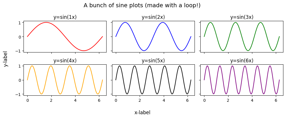
✅ Question 10
What does the last command, plt.tight_layout() in the example code do? Try commenting it out to see how it changes things.
✎ Put your answer here
Congratulations, you’re done!
Submit this assignment by uploading it to the course Canvas web page. Go to the “In-class assignments” folder, find the appropriate submission link, and upload it there.
See you next class!
© Copyright 2026, Division of Plant Science & Technology—University of Missouri
- Heinicke, M. P., Nielsen, S. V., Bauer, A. M., Kelly, R., Geneva, A. J., Daza, J. D., Keating, S. E., & Gamble, T. (2023). Reappraising the evolutionary history of the largest known gecko, the presumably extinct Hoplodactylus delcourti, via high-throughput sequencing of archival DNA. Scientific Reports, 13(1). 10.1038/s41598-023-35210-8