To which switchgrass should we swiftly switch?
Credits: Missouri Department of Conservation
Learning goals of today’s assignment
Compute confidence intervals via bootstrap and formula
Recognize that the pre-class CI formula has pitfalls and tend to underestimate the true interval
Practice matplotlib for confidence bands
Assignment instructions
Work with your group to complete this assignment. Instructions for submitting this assignment are at the end of the notebook. The assignment is due at the end of class.
Background
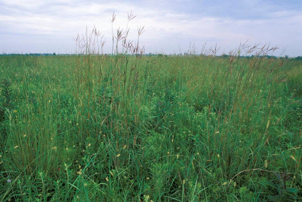
Switchgrass, a potential biofuel crop, is a genetically diverse species with phenotypic plasticity enabling it to grow in a range of environments and native to North American prairies. Two primary divergent ecotypes, uplands and lowlands, exhibit trait combinations representative of acquisitive and conservative growth allocation strategies, respectively. Whether these ecotypes respond differently to various types of environmental drivers remains unclear but is crucial to understanding how switchgrass varieties will respond to climate change. Altogether, this research provides essential knowledge for improving the viability of switchgrass as a biofuel crop.
The end goal is to reproduce the results from Figure 2b in Ricketts et al (2023).
Ricketts, M. P., Heckman, R. W., Fay, P. A., Matamala, R., Jastrow, J. D., Fritschi, F. B., Bonnette, J., Juenger, T. E. (2023). Local adaptation of switchgrass drives trait relations to yield and differential responses to climate and soil environments. GCB Bioenergy, 15, 680–696.
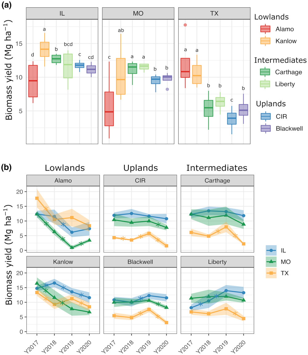
Credits: Ricketts et al (2023)
✅ Question 1
In your own words, what information do you get out of Figure b?
✎ Put your answer here
1. Mean switchgrass yields
# Importing the usual libraries

import pandas as pd
import numpy as np
import matplotlib.pyplot as plt
from scipy import stats
✅ Task 2
Load the data set HARVEST.tsv with pandas
Note that it is a TSV file: tab-separated file.
Python encodes tabs as
\t.What parameter of
pd.read_csvdo you need to specify to load the file correctly?Display the first few rows of the DataFrame to make sure it looks ok.
# Load with pandas1.1 Wrangling with Series.str
Notice that the YEAR column is a string because it has a Y at the beginning of every entry. For reasons that will be clearer later, it will be easier to have YEAR as an int instead.
One way fix it is to convert the
YEARSeries to an actual datetime datatype with pd.to_datetime and specifying the rightformatparameter.We saw this strategy for Homework 3.
It works best when your column also has month or even day information.
Another way is to remove the starting
Ycharacter with the.str.removepreffixfunction and the use.astypeto convert the prefix-less strings to ints.The
.strtells pandas that your Series is all strings: there are plenty of things pandas can do with strings (making the all uppercase or lowercase, replace one word with another, check if this or that word shows up, etc).
Important: both strategies only work for Series. Make sure you are working <your_dataframe>['YEAR'] (a Series) instead of <your_dataframe>.
✅ Task 2
Convert the year column to an int datatype
Replace the year column with the newly transformed Series
# Your code1.2 Summarizing the data
Columns to pay attention to for this assignment:
| Column Name | Description |
|---|---|
SITE | state where the experiment was carried out |
GENO | switchgrass genotype (6 varieties in total) |
YEAR | year of harvest (beware, it is a string) |
BIOMASS_AVG_Mg_ha | switchgrass yield |
✅ Task 3
Compute the mean, standard error, and counts of biomass yield for switchgrass for each year, site, and genotype.
Use
groupbyto group your row values by year-site-genotype and get the means and standard errors in a single line.Save the DataFrame as
summary: it should be 72 rows by 6 columns.
Hint: pandas has a .count function.
# Your summary computed in a single line thanks to groupby

# groupby( [ list with the names of columns with metadata to consider ] , as_index=False)\
         #[ string or list of columns with numerical values to group ]\
         #.agg([list of strings related to the functions to apply to the grouped values])

# the backslash `\` helps us break a single line of code into multiple ones.
1.4 Visualization
Let’s make sure that our data looks right. Instead of reproducing all of Figure 2b at once, let’s start small: one genotype at a time.
✅ Task 4
Plot mean yield vs year for the
'Alamo'genotypeUse different colors and markers for different sites
Make sure your plot is labeled
Add a grid to your plot
Hints:
Define two lists: one with colors and another for markers
Use the
genotypestring variable below to make a subDataFrame out ofsummaryonly looking at data from that one genotypeThen plot all the sites by looping through
sites(list given below)Make a sub-subDataFrame for yield values just for this site
Remember that
.plotlets you draw both lines and markers by adding the parametermarker
# Finish the code
genotype = 'Alamo'
sites = np.sort( summary['SITE'].unique() )
print(sites)

# colors = []
# markers = []

# fig, ax = ...
# loop through the IL, MO, TX sites:
     # sub_df = only the rows of summary corresponding to genotype and to the looped sites[i]
     # plot ( sub_df year , sub_df yield, label sites[i], makers[i], colors[i] ,...)

# titles, labels, grids, and legend
---------------------------------------------------------------------------
NameError Traceback (most recent call last)
Cell In[5], line 3
1 # Finish the code
2 genotype = 'Alamo'
----> 3 sites = np.sort( summary['SITE'].unique() )
4 print(sites)
6 # colors = []
7 # markers = []
8
(...)
13
14 # titles, labels, grids, and legend
NameError: name 'summary' is not defined2. Confidence intervals
Notice that in Figure 2b, the plot lines also come with shaded bands.
✅ Question 5
According to 2b’s caption, what’s the meaning of these shaded areas?
How many switchgrass measurements were collected per year-site-genotype?
✎ Put your answer here
2.1 Computing intervals with the formula
✅ Task 6
Compute the width of the 95% confidence interval for every row in the
summarydataframe:Notice that you have almost all the information you need in the
summarydataframe if you use the CI formula.Remember that you can compute quantiles with the
stats.t.ppffunction.Add the interval width value as a new column of
summary.
Remember that you can easily add a new column to an existing dataframe by doing:
my_dataframe['new_column_name'] = new_column_values# Your code2.2 Visualizing intervals
✅ Task 7
Start by copy/pasting your matplotlib code from (1.4)
Use the
.fill_betweenfunction to draw shades—confidence intervals—that follow the lines and markers you already drew.Remember that the confidence interval is
Make sure you have overlaid a grid!
Does your final plot look like Alamo in 2b? (Spoiler: it should be close but not equal).
# Copy/paste your code from (1.4) and edit accordingly
# The fill_between goes inside the loop
3. Gear switch: Matplotlib practice
Now let’s reproduce Figure 2b from Ricketts et al! Just a reminder on how the Axis interface initialization works for Matplotlib:
✅ Task 8
Run the cell below and add comments to the lines that are new to you
Write new lines (in the appropriate place) to plot the average switchgrass yield for all years, sites, and genotypes.
Add shades using the CI values you computed in (2.1)
You can base your answer on what you already have from (2.2)
Explore
ax[i].textby toying with it:Change
0.98, 0.98for0.02, 0.98or0.98, 0.5Change
hatocenterorleft. What other options are there forha?Change
vatocenterorbottom. What other options are there forva?
# Run and comment

fs = 12
tts = ['Lowlands', 'Uplands', 'Intermediates']
genotypes = ['Alamo', 'CIR', 'Carthage', 'Kanlow', 'Blackwell', 'Liberty']

# Dictionary with properties for the bounding box used with ax[i].text
bbprops = {'boxstyle':'round', 'pad':0.1, 'ec':'snow', 'facecolor':'wheat', 'alpha':1}

fig, ax = plt.subplots(2, 3, figsize=(12, 5), sharex=True, sharey=True)
ax = np.atleast_1d(ax).ravel()

for i in range(3):
    ax[i].set_title(tts[i], fontsize=1.25*fs)

for i in range(len(genotypes)):
    ax[i].set_facecolor('snow')
    ax[i].tick_params(labelsize=fs)

    # The transform parameter makes the coordinates relative for `ax[i].text` ONLY
    # The left-right x-coordinates go from 0 to 1 (regardless of the actual x-axis values)
    # The bottom-top y-coordinates go from 0 to 1 (regardless of the actual y-axis values)
    # That way, 0.98, 0.98 are the coordinates of the top-right corner
    # ha and va (horizonatal and vertical alignment) define how the text will be anchored
    ax[i].text(0.98,0.98, genotypes[i], transform=ax[i].transAxes, ha='right', va='top', fontsize=fs, bbox=bbprops)


fig.supylabel('Biomass yield [Mg/ha]', fontsize=1.25*fs)

# Uncomment these lines to plot the legend
# Essentially we are only plotting the legend of the first plot (because it is the same legend for the rest)
# Otherwise, we would plot 6 times the same legend

#h,l = ax[0].get_legend_handles_labels()
#fig.legend(h,l, loc='center left', bbox_to_anchor=(1.0,0.5), frameon=True, fontsize=fs)

fig.tight_layout()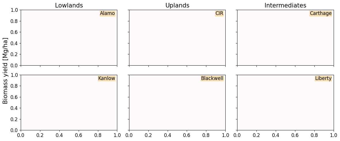
Further reading
You can read more about the
tranformparameter in.text()here: https://matplotlib .org /stable /users /explain /artists /transforms _tutorial .html Read more about text alignment (
vaandha) here: https://matplotlib .org /stable /gallery /text _labels _and _annotations /text _alignment .html
Congratulations, you’re done!
Submit this assignment by uploading it to the course Canvas web page. Go to the “In-class assignments” folder, find the appropriate submission link, and upload it there.
See you next class!
© Copyright 2026, Division of Plant Science & Technology—University of Missouri
- Ricketts, M. P., Heckman, R. W., Fay, P. A., Matamala, R., Jastrow, J. D., Fritschi, F. B., Bonnette, J., & Juenger, T. E. (2023). Local adaptation of switchgrass drives trait relations to yield and differential responses to climate and soil environments. GCB Bioenergy, 15(5), 680–696. 10.1111/gcbb.13046
- Ricketts, M. P., Heckman, R. W., Fay, P. A., Matamala, R., Jastrow, J. D., Fritschi, F. B., Bonnette, J., & Juenger, T. E. (2023). Local adaptation of switchgrass drives trait relations to yield and differential responses to climate and soil environments. GCB Bioenergy, 15(5), 680–696. 10.1111/gcbb.13046