How do Christmas tree tubeworms react to warming oceans?
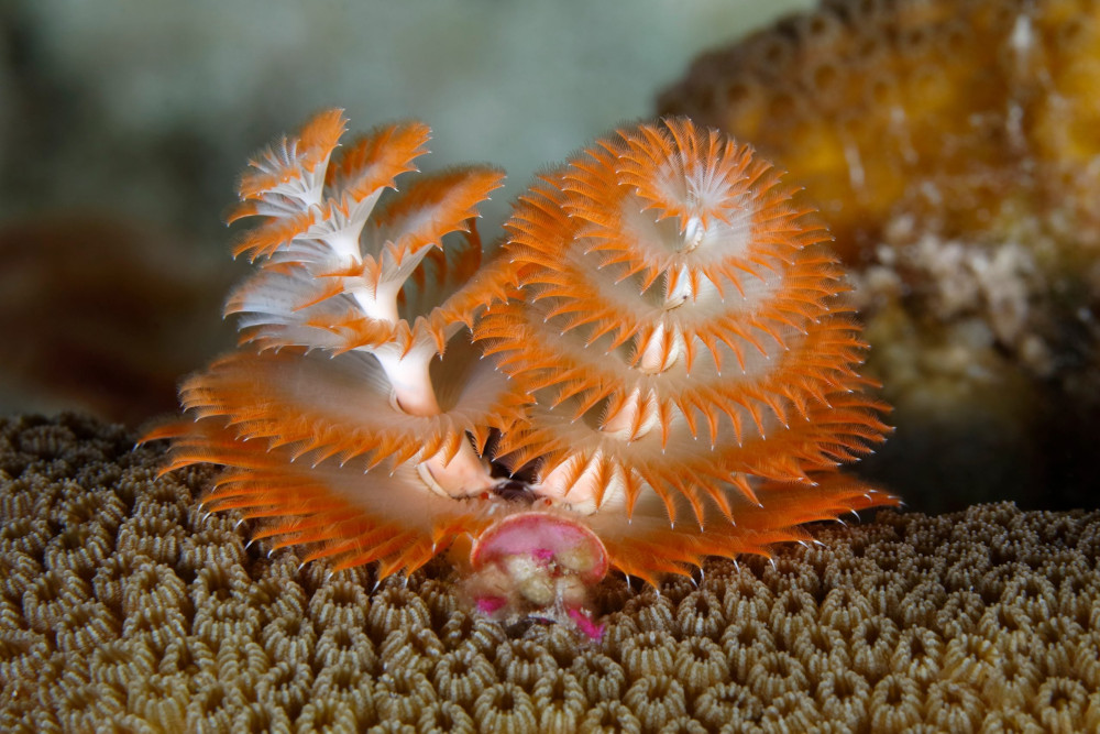
Credits: American Oceans
Learning goals of today’s assignment
Recognize that Q-Q plots are much better (compared to histograms) to visually determine if our data follows a specific distribution.
Use Pandas to transform our data to visually assess for homoscedasticity
Understand the importance of visual confirmations of statistical tests
Determine if rising ocean temperatures represent a concern for tubeworms
Assignment instructions
Work with your group to complete this assignment. Instructions for submitting this assignment are at the end of the notebook. The assignment is due at the end of class.
Background
In today’s activity, were going to look at a Christmas tree tubeworm acclimation dataset. We’ll check if water temperature has a statistically significant effect in their oxygen consumption and amonia excretion rates. But before doing any serious statistical claims, we must make sure that the data visually looks the part.
The end goal is to reproduce the results from Figures 2 in Sánchez-Ovando et al. (2025)
Sánchez-Ovando, J.P., Díaz F., Norzagaray-López, O., Lafarga-De la Cruz, F., Angeles-Gonzalez, L.E., Benítez-Villalobos, F., Re-Araujo, D. (2025) Metabolic Responses of Christmas Tree Worms (Serpulidae: Spirobranchus) to Thermal Acclimation. Journal of Experimental Zoology Part A Ecological and Integrative Physiology, 343(8), 911–920
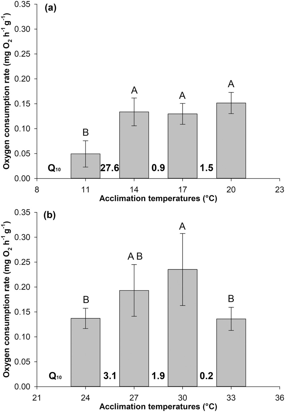
Credits: Sánchez-Ovando et al (2025)
✅ Question 1
In your own words, what story do you infer from Figure (a)?
✎ Put your answer here
1. Setting everything up
1.1 Import packages
Import the usual libraries: NumPy, matplotlib, pandas, and stats. It is a good idea to start a “random” number generator with a fixed seed as well.
# Import the usual libraries
import numpy as np
import pandas as pd
from matplotlib import pyplot as plt
from scipy import stats

rng = np.random.default_rng(seed = 42)
nudge = rng.uniform(-0.15, 0.15, 1000)
1.2 Loading the data: Excel files
Notice that we have two Excel spreadsheets (XLSX files), one per tubeworm species. Each Excel has two sheets: oxygen consumption and ammonia excretion rates under different water temperatures, respectively.
✅ Task 2
Load as a DataFrame named
datathe data corresponding to oxygen consumption for S spinosus.Display the DataFrame and make sure it matches the Excel spreadsheet.
Pandas has the pd.read_excel function to read Excel file. Make sure you understand its sheet_name argument.
# Load with pandas1.3 Quick statistical summaries
In this case, we don’t need to mask: all the data we need is exactly in data, one sample per column. So we can compute all the oxygen consumption means and standard errors with just a line each instead of looping and appending.
✅ Task 3: the 95% confidence interval
For the first column, compute the width of its 95% confidence interval.
Remember that for a Series, you can get its standard error with the
.semfunction.The quantiles can be computed with the
stats.t.ppffunction.
# Your code
# ci = t * sem
1.4 Make a jitterplot of the data
As always, before jumping straight into analysis, it is a good idea to visualize the data to inform our next steps.
✅ Task 4: Code tinkering
Make a jitterplot of the oxygen consumption data you just loaded: one jittery column per temperature.
With
ax.errorbarand T3, plot the 95% confidence interval of the mean for each jittery column.Don’t worry about labels, colors, or markers: right now we just want to have an idea how things look like in the first place.
Remember that
yvalues = data.iloc[:,0]returns the values in the first column,yvalues = data.iloc[:,1]returns the second column, etc.
# Tinker the code from Day 19
'''
colors = ['b', 'b', 'b', 'b']
x_position = [0,1,3,4]

fig, ax = plt.subplots( figsize=(6,6) )
ax.set_facecolor('snow')
for i in range(len(xpos)):

    yvalues = weights[i]
    ax.scatter(x_position[i]+nudge[:len(yvalues)], yvalues, fc=colors[i], zorder=2)

    ci = stats.t.ppf(0.975, len(yvalues)-1)*yvalues.sem()
    ax.errorbar(x_position[i], yvalues.mean(), yerr=ci, color='k', mew=1, elinewidth=1, capsize=5, mfc='w', marker='D', zorder=3)

ax.set_xticks(x_position, ['BT','ISO','BT','ISO']);
'''
"\ncolors = ['b', 'b', 'b', 'b']\nx_position = [0,1,3,4]\n\nfig, ax = plt.subplots( figsize=(6,6) )\nax.set_facecolor('snow')\nfor i in range(len(xpos)):\n\n yvalues = weights[i]\n ax.scatter(x_position[i]+nudge[:len(yvalues)], yvalues, fc=colors[i], zorder=2)\n\n ci = stats.t.ppf(0.975, len(yvalues)-1)*yvalues.sem()\n ax.errorbar(x_position[i], yvalues.mean(), yerr=ci, color='k', mew=1, elinewidth=1, capsize=5, mfc='w', marker='D', zorder=3)\n\nax.set_xticks(x_position, ['BT','ISO','BT','ISO']);\n"✅ Question 5
Just looking at the jitterplot and the confidence intervals, do you think that tubeworm oxygen consumption rate changes with water temperature?
What temperatures show the same consumptions rates? What temperatures are different?
Remember the rule of thumb: whether two samples have similar means or not will depend on whether their confidence intervals overlap or not.
✎ Put your answer here
2. Checking for normality
Now we need to statistically check if our data is normally distributed or not, so we can decide if we perform either parametric or non-parametric tests.
2.1 Q-Q plots with np.quantile and stats.norm.ppf
As mentioned in the pre-class, to do a Q-Q plot we need to:
Get
Nquantiles from the data.Get those same
Nquantiles from the normal distribution (with mean and standard deviation equal to the sample).Compare the quantiles of our data versus the quantiles of a known distribution with an identity line.
✅ Task 6
Make an array
quantilesconsisting ofN = 9evenly spaced numbers starting with 0.1 and finishing with 0.9. Do you remember which NumPy function can do this?Then compute the data quantiles
qdatawithnp.quantilefor 11°C values.
Notes:
The 0.00 and 1.00 quantiles of the normal distribution are and respectively. That’s why we consider only quantiles between 0.05 and 0.95.
Since we only have 12 data points per temperature, it makes little sense to consider anything more than 12 quantiles.
# Your code

N = 9

#quantiles = ...
#qdata = np.quantile( values from 11 C )
✅ Task 6 (continued)
Now with the normal percent point function
stats.norm.ppf, compute the same quantilesqnormala normal distribution.
Remember that this distribution has the same mean (loc) and SD (scale) values as the sample data.
# Normal quantiles

# qnormal = stats.norm.ppf(quantiles, loc=?, scale = ?)
✅ Task 7
Now we can finally make Q-Q plots. Remember that we need to check that each of the temperature data is normally distributed.
Make a 1x4 panel: 4 subplots (1 per temperature) arranged in a single row. Each will be a Q-Q plot.
You will need to repeat the
qdataandqnormalcomputations inside the loop.With
axline, plot the identity lineWe know that all the points in this line are of the form , like
(normq[0], normq[0])for example.We know its slope is 1.
# Finish the code

fig, ax = plt.subplots(1, len(data.columns), figsize=(12,3.5))
fig.suptitle('Q-Q plots')

for i in range(len(ax)):
    ax[i].set_facecolor('snow')

    # Compute the data quantiles
    # Compute the normal quantiles

    ax[i].set_title(data.columns[i])
    # Q-Q plots

    # identity line

fig.tight_layout()
---------------------------------------------------------------------------
NameError Traceback (most recent call last)
Cell In[7], line 3
1 # Finish the code
----> 3 fig, ax = plt.subplots(1, len(data.columns), figsize=(12,3.5))
4 fig.suptitle('Q-Q plots')
6 for i in range(len(ax)):
NameError: name 'data' is not defined✅ Question 8
Based off the plots and the correlation coefficients, do you think the data is normally-ish distributed for every temperature?
Which two-sample test would you use to test for differences between temperatures?
✎ Put your answer here
✅ Question 9
What if you increase the number of quantiles, say N = 15 or N = 50? Does that change your perception of Question 8?
✎ Put your answer here
3. Verifying differences with t-tests
The data is normal-ish: none of the scatters is too far removed from following an identity line. Which means that Welch’s t-tests are appropriate to check if oxygen consumption rates vary with temperature. We also have a hunch of what temperatures should behave differently based on the jitterplot and Q5.
✅ Question 10
In tubeworm and oxygen consumption rate terms, what is the null hypothesis posed by the Welch’s t-test when comparing the 11C and 14C samples?
✎ Put your answer here
✅ Task 11
Compute and print the t-test associated p-values when comparing all possible pairs of temperatures. There are six possible different pairs in total.
Optional: Can you think of a way to make a nested loop to go through all combinations?
# Your code✅ Question 12
If we go with a significance level of 0.05, which oxygen consumption rates change with temperature? Which stay the same?
Do your statistical conclusions support your visual hunch?
Important: The p-values are only one part of the story. They should be used to confirm rather than to drive your conclusions. The main driver should always be domain knowledge and data visualizations.
✎ Put your answer here
4. [Time-permitting] Looking at the other species
Repeat the whole Notebook but this time looking at S. cf corniculatus, the other tubeworm species in the dataset.
✅ Question 13
For the Q-Q plots, do most of the samples look normal-ish?
✎ Put your answer here
Congratulations, you’re done!
Submit this assignment by uploading it to the course Canvas web page. Go to the “In-class assignments” folder, find the appropriate submission link, and upload it there.
See you next class!
© Copyright 2026, Division of Plant Science & Technology—University of Missouri
- Sánchez‐Ovando, J. P., Díaz, F., Norzagaray‐López, O., Lafarga‐De la Cruz, F., Angeles‐Gonzalez, L. E., Benítez‐Villalobos, F., & Re‐Araujo, D. (2025). Metabolic Responses of Christmas Tree Worms (Serpulidae: Spirobranchus) to Thermal Acclimation. Journal of Experimental Zoology Part A: Ecological and Integrative Physiology, 343(8), 911–920. 10.1002/jez.70008