✅ Put your name here
Visual statistics or “It is DataViz all the way down”
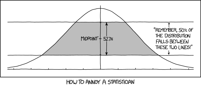
Credits: xkcd.com
Learning goals for today’s pre-class assignment
Be able to articulate what a normal distribution is and its three main properties
Learn to visually check for normality using Q-Q plots
Learn to visually check for homoscedasticity
Emphasize the need for good data visualization to guide our statistical conclusions.
Assignment instructions
This assignment is due by 11:59 p.m. the day before class, and should be uploaded into the appropriate “Pre-class assignments” submission folder. If you run into issues with your code, make sure to use Slack to help each other out and receive some assistance from the instructors. Submission instructions can be found at the end of the notebook.
In this Notebook we’ll be referring to means, variances, and standard deviations quite a bit. If you feel you need a refresher in these concepts, scroll to the bottom (before the survey) for a video covering these topics.
1. The Welch’s t-test: setting the stage
Last class we discussed t-tests as useful tools to determine whether two samples have similar means or not. However, you must always remember that the t-test might fail if your data does not follow some requirements:
Normal-ish distribution: data from both populations must be sort of normally distributed
~~Homoscedasticity: the variance (or standard deviations) within each population is sort of the same~~ (Welch’s test does not need this)
Notice that the key word is sort of. But how much sort of is actually sort of?
1.1 The usual—and wrong—pipeline
In plenty of peer-reviewed research papers, you will see a common statistical methodology when it comes to t-tests:
Do a Shapiro-Wilk tests to check if your samples are normally distributed. Don’t worry much about the true meaning of Shapiro-Wilk, just keep in mind that it will return a p-value.
Verify that all the Shapiro-Wilk p-values are large so you claim that all your samples are indeed normally distributed.
Do a Levene test to check if your samples all share the save standard deviation. Don’t worry much about the true meaning of Levene, just keep in mind that it will return a p-value.
Verify that the Levene p-value is large so you claim homoscedasticity—equal variances.
Claim that the Student’s t-test conditions are met and you can trust its p-values.
By using Welch’s, we don’t need steps 3–4.
However, the pipeline described above is ill-posed. Shapiro-Wilk or Levene are just examples. Each test in a sense is like a Jenga piece, and the more tests you do based on other tests, the higher chances are that you have an unstable tower waiting to collapse.
All normality tests—Shapiro-Wilks, Kolmogorov-Smirnov, Darling-Anderson, etc.—answer correctly the incorrect question. These tests pose the question:
Is there enough evidence to say that the sample values are not normally distributed?
When in reality, the question that most scientists want to know is:
Are my values good enough to do a meaningful t-test?
1.2 DataViz as the alternative
That does not mean you can ignore normality requirements. It means that you should check for it visually rather than just numerically. Statistical testing is important, but it is only meaningful if it is supported with visualizations!
Checking for homoscedasticity (lovely mouthful), while not relevant for Welch’s, it is important when trying to assess the meaningfulness of a model fit. We will discuss more about homoscedasticity when we get to cross that bridge.
2. Q-Q plots to check if our data follows this or that distribution
2.1 A word on probability distributions
Before we jump into Q-Q (quantile-quantile) plots, it is important we make sure we understand the meaning of “probability distributions”.
from IPython.display import YouTubeVideo
YouTubeVideo("oI3hZJqXJuc",width=640,height=360)✅ Task 1
Take the StatTest on probability distributions here.
Take a screenshot of your result and attach it along this Notebook.
2.2 A word on quantiles
As stated above, Q-Q stands for Quantile-Quantile. We discussed quantiles a bit when discussing boxplots. Remember that for a boxplot, the box represents the 25% and 75% quantiles, with a mark of the median (the 50% quantile) in between.
Now watch this video on quantiles and how they are not limited to boxplots. Python also comes with nine different ways to compute quantiles.
YouTubeVideo("IFKQLDmRK0Y",width=640,height=360)✅ Question 1
Is there a practical difference when talking about quantiles instead of percentiles? Can we use them interchageably?
✎ Put your three answers here.
✅ Question 2
Consider two sets of datapoints
a = [0, 1, 2, 3, 4]
b = [0, 1, 2, 3, 4, 5]
Off the top of your head, can you guess which is the 50% quantile value for each array?
✎ Put your three answers here.
✅ Task 3
Now use NumPy to compute the 50% quantile for each of the arrays above. Did you guess correctly?
Does the quantile have to coincide with the value of a data point?
You can use NumPy’s function np.quantile.
# Your code
a = [0, 1, 2, 3, 4]
b = [0, 1, 2, 3, 4, 5]
2.3 The Q-Q plot
Now that you know about probability distributions and quantiles, let’s dig into quantile-quantile plots.
Watch the video below for a rundown on what a Q-Q plot is and how to use it.
YouTubeVideo("okjYjClSjOg",width=640,height=360)✅ Question 4
List the steps to get a Q-Q plot.
✎ Put your answers here.
Step one
Step two
etc
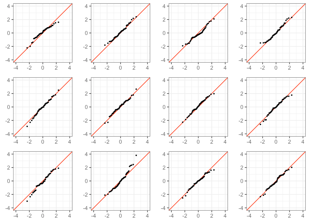
Credits: Social Science Computing Core. University of Wisconsin–Madison
One thing to keep in mind is that points will rarely follow the identity line perfectly. The best way to become better at visually identifying departures from normality is to become more familiar with the appearance of (relatively) normal data. For instance, the 12 plots above were generated with artificial data sampled from an actual normal distribution. Even in an artificial case, you can see some deviations from the identity line, and that’s ok.
✅ Question 5: is this normal?
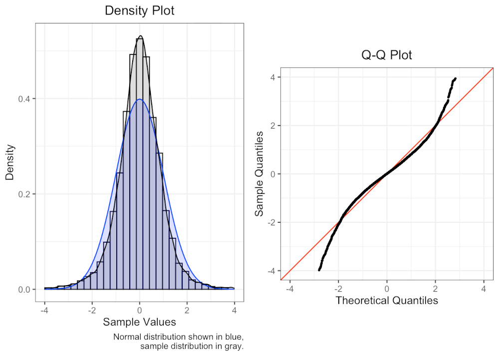
Credits: Social Science Computing Core. University of Wisconsin–Madison
Based on the Q-Q plot alone, does it look like the sample data above was drawn from a normal distribution? (Ignore the histogram on the left)
Explain your reasoning in favor or against normality.
✎ Put your ideas here.
Get more familiar with how normal and non-normal Q-Q plots look like by checking the examples displayed here: https://
3. A Q-Q example
Finally, let’s go through an example of plotting an actual Q-Q plot. In the past in-class, we did Welch tests but never checked if our datapoints were normalish. We will focus again on average larval weight data under different soil treatment conditions and corn varieties for Bt-susceptible corn rootworms.
We first load the necessary modules:
import numpy as np
import pandas as pd
import matplotlib.pyplot as plt
from scipy import stats
Then we load the CSV as a DataFrame
Notice that in pandas we can stack operations: load and then immediately drop the rows with NaNs for larval weight
data = pd.read_csv('210602_fitness_data.csv').dropna(axis='index', how='any', subset=['weight_per_larvae'])
data.head()At the same time, we establish a sequence of 9 quantiles to compute:
0.1, 0.2, ..., 0.9. The choice of 9 quantiles is ultimately arbitrary.
quantiles = np.linspace(0.1, 0.9, 9)
quantiles
array([0.1, 0.2, 0.3, 0.4, 0.5, 0.6, 0.7, 0.8, 0.9])Now focus just on Bt-susceptible corn rootworms
colony = 'SUS'
df = data[ data['colony'] == colony ]
df.head()We then loop both soil treatments (conservational
CCvs traditionalTR)And for each treatment, we loop both corn types (Bt-expressing
BTvs non Bt-expressingISO)For every sample, we compute its 9 quantiles with
np.quantile.We also compute these 9 quantiles for a normal distribution with
stats.norm.ppf.Notice that we also set this normal distribution to have the same mean (
loc) and standard deviation (scale) as that for the sample
Make a scatterplot of normal vs sample quantiles
Draw the identity line with
axline.
✅ Task 6
Run the code below and comment each line. If you are unsure what a specific line of code does, write so in Q7.
# run and comment
fig, ax = plt.subplots(1,4, figsize=(10,3))

i = 0
for treat in ['CC', 'TR']:
    for corn in ['BT', 'ISO']:
        # Larval weight only for a set soil treatment and corn type
        weights = df.loc[ (df['treatment'] == treat) & (df['corn_trait'] == corn) , 'weight_per_larvae']

        qdata = np.quantile(weights, quantiles)
        qnormal = stats.norm.ppf(quantiles, loc=weights.mean(), scale=weights.std())

        ax[i].set_title(f'({treat} , {corn})', fontsize=12)
        ax[i].scatter(qdata, qnormal, c='b')
        ax[i].axline(xy1=(qweight[0], qweight[0]), slope=1, c='r')
        i += 1

fig.supxlabel('Data quantiles', fontsize=12)
fig.supylabel('Normal quantiles', fontsize=12)
fig.tight_layout();
---------------------------------------------------------------------------
NameError Traceback (most recent call last)
Cell In[9], line 15
13 ax[i].set_title(f'({treat} , {corn})', fontsize=12)
14 ax[i].scatter(qdata, qnormal, c='b')
---> 15 ax[i].axline(xy1=(qweight[0], qweight[0]), slope=1, c='r')
16 i += 1
18 fig.supxlabel('Data quantiles', fontsize=12)
NameError: name 'qweight' is not defined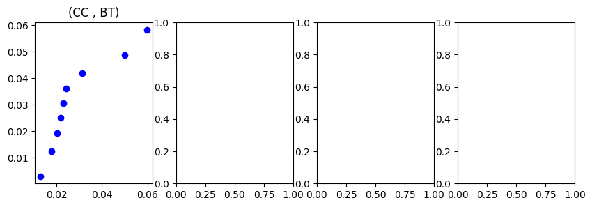
✅ Question 6
Remember that a linear trend in a Q-Q plot suggests that the data follows the set distribution.
Based on the Q-Q plots above, do you think the larval weight data is normally-ish distributed?
In which cases it is normal-ish? In which cases it is not?
✎ Put your answers here.
✅ Question 7
Do you think it was a good idea to do Welch’s t-tests in the last In-Class when analyzing these Western corn rootworm data?
✎ Put your answers here.
✅ Task 8
Add comments to any bits of code—or make a note of them below—that are super obscure to you. We will discuss such bits in class.
✎ Put your answers here.
4. Boxplots, barplots, and scatterplots
Just one more time, because it cannot be emphasized enough: good visualization is a crucial step for good data analysis. The keyword is good. Notice that for this assignment you were presented with a scatterplot instead of the boxplots found in the original figure.
Research shows over, over, and over again that boxplots and barplots tend to muddle our understanding of the data and are prone to misinterpretation and abuse. In fact, some academic journals are explicitly discouraging paper submissions that do not visually show the actual data points.
Now watch this short video on how boxplots can distort our understanding of the data. (Barplots are even worse offenders)
YouTubeVideo("LawTD2KR3Io",width=640,height=360) Now compare the following three plots. The are made with the exact same data, but the way the data is displayed is different.

Adapted from: Kettenbach et al (2017)
A: your typical barplot. The height of each bar is the mean, with 95% confidence interval bars.
B: your typical boxplots. The box limits are the 25th and 75th quantiles. The thick black line in between depicts the median. The floating points are marked as outliers.
C: scatterplot of the data with some jitter to enhance visualization. The white diamonds are the sample means with error bars depicting the 95% confidence intervals.
✅ Question 8
From the tasks above we know that Hoosier West is different to both Hoosier East and Weston Pass, while Weston Pass and Hoosier East are statistically similar.
What information is clearer to observe going from A to B?
What about going from B to C?
From which plot is easiest to visualize that conclusion? Explain your answer.
Do you agree that the points deemed outliers in B (blank circles) are truly outliers? Explain your answer.
✎ Put your answer here.
Additional reading (optional)
This blog entry has a brief but poignant discussion on boxplots versus scatterplots. It has plenty of visual examples (because you can’t discuss dataviz without visualizations.)
(If you need one) Quick stats reminder
So far we have mentioned means, variances, and standard deviations quite a bit. Here’s a good StatQuest that goes over all the basic statistics concepts if you find yourself confused:
Means
Standard deviations
Histograms
Distributions
from IPython.display import YouTubeVideo
YouTubeVideo("SzZ6GpcfoQY",width=640,height=360)Congratulations, you’re done!
Submit this assignment by uploading it to the course Canvas web page. Go to the “Pre-class assignments” folder, find the appropriate submission folder link, and upload it there.
See you in class!
© Copyright 2026, Division of Plant Science & Technology—University of Missouri
- George, C. H., Stanford, S. C., Alexander, S., Cirino, G., Docherty, J. R., Giembycz, M. A., Hoyer, D., Insel, P. A., Izzo, A. A., Ji, Y., MacEwan, D. J., Sobey, C. G., Wonnacott, S., & Ahluwalia, A. (2017). Updating the guidelines for data transparency in the British Journal of Pharmacology – data sharing and the use of scatter plots instead of bar charts. British Journal of Pharmacology, 174(17), 2801–2804. 10.1111/bph.13925
- Heidt, A. (2024). Bad bar charts distort data — and pervade biology. Nature, 636(8042), 512–512. 10.1038/d41586-024-03996-w
- Weissgerber, T. L., Milic, N. M., Winham, S. J., & Garovic, V. D. (2015). Beyond Bar and Line Graphs: Time for a New Data Presentation Paradigm. PLOS Biology, 13(4), e1002128. 10.1371/journal.pbio.1002128
- Kettenbach, J. A., Miller‐Struttmann, N., Moffett, Z., & Galen, C. (2017). How shrub encroachment under climate change could threaten pollination services for alpine wildflowers: A case study using the alpine skypilot,Polemonium viscosum. Ecology and Evolution, 7(17), 6963–6971. 10.1002/ece3.3272