✅ Put your name here
Non-linear curve-fitting and assessing your fit
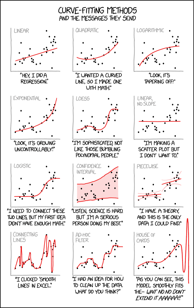
Credits: xkcd.com
Learning goals for today’s pre-class assignment
Use SciPy’s
optimize.curve_fitfunction to compute various kinds of regressions.Fit and interpret confidence bands and intervals to your linear prediction.
Understand how confidence bands are similiar and different compared to confidence intervals
Assignment instructions
This assignment is due by 11:59 p.m. the day before class, and should be uploaded into the appropriate “Pre-class assignments” submission folder. If you run into issues with your code, make sure to use Slack to help each other out and receive some assistance from the instructors. Submission instructions can be found at the end of the notebook.
Make all the needed imports before anything else
import numpy as np
import pandas as pd
from matplotlib import pyplot as plt
from sklearn import metrics
1. Univariate models and least squares optimization
In the past classes, we have worked with univariate models: we have one independent variable in the axis—like protein content or femur circumference—that we use to predict one response variable in the axis—like oil content or body mass.
So far we have focused on linear models. Which means we are looking for constant numbers and that make the best fit:
which gives us predicted responses (notice the hat symbol on top of it.)
1.1 Mathematically speaking, what makes a line the best-fit line: least squares optimization
Usually in our data, we have independent values alongside corresponding response variables. Any pair of values will give us a set of predictions . We are looking specifically for the and so that most of the ’s are as close as possible to the ’s most of the time.
In other words, we are looking for so that the least squares function is as small as possible:
In mathematical lingo, we want to optimize the least squares function. Keep in mind that the least squares method works in general for any parametric function, not just lines. More on that later.
1.2 Beyond linear models
Say we want to fit a quadratic model:
In such cases, we can use the optimize sub-module from SciPy and its curve_fit fuction! This function optimizes the function.
Let’s load it! Notice that we can load several sub-modules from SciPy at once.
from scipy import stats, optimize2. A quadratic example: Nitrogen versus biomass accrual in wild spinach
Allometry is not limited to animals but it explains plant development as well. Let's look at Chenopodium album (wild spinach) data and its relationship between nitrogen accrual and plant age. The data comes from Bernacchi et al (2007), where they look at a quadratic allometric relationship:
Notice that the proposed best-fit “lines” in the figure below are not really lines but parabolas: a degree-2 polynomial instead of a degree-1 polynomial (a line).
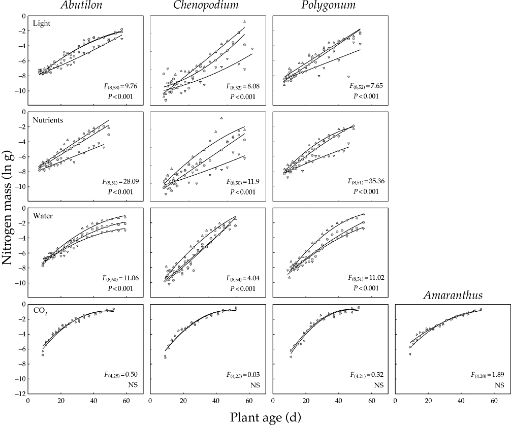
Credits: Bernacchi et al (2007)
More information:
Bernacchi, CJ, Thompson, JN, Coleman, JS and McConnaughay, KDM (2007) Allometric analysis reveals relatively little variation in nitrogen versus biomass accrual in four plant species exposed to varying light, nutrients, water and CO2. Plant, Cell & Environment, 30: 1216–1222.
2.1 Loading and masking the data
We first load the data set
Bernacchi et al 2007.xlsand make sure it looks good.
data = pd.read_excel('Bernacchi et al 2007.xls')
print('The dataset contains', data.shape[0], 'rows and', data.shape[1], 'columns.')
data.head()
The dataset contains 720 rows and 9 columns.
We will focus just on the data for wild spinach (Chenopodium) under different light conditions.
species, gradient = 'CHENOPODIUM', 'LIGHT'
#species, gradient = 'ABUTILON', 'WATER'

df = data[(data['SPECIES'] == species) & (data['GRADIENT'] == gradient)]
df.head()And to keep things even smaller, let’s start by looking at those samples subject to medium light conditions.
We want to relate plant age (independent variable) to log Nitrogen mass (response variable).
Let’s make a scatter plot to have a better idea what we are dealing with.
level = 'MEDIUM'
xvals = df.loc[df['LEVEL'] == level, 'AGE']
yvals = np.log(df.loc[df['LEVEL'] == level, 'N mass (g)'])

# Make a plot
fs = 12
fig, ax = plt.subplots(figsize=(4,3))
ax.scatter(xvals, yvals, c='b', marker='.', label=level.title())
ax.set_xlabel('Age', fontsize=fs)
ax.set_ylabel('Ln (N mass)', fontsize=fs)
ax.set_title(f'{species.title()} ({gradient.title()})' , fontsize=fs)
ax.legend(loc='lower right');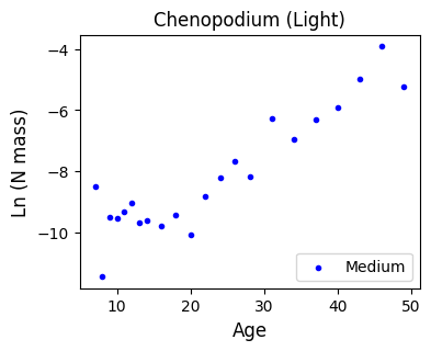
3. My first optimize.curve_fit
The optimize.curve_fit function can be used to fit any parametric function to our data via least squares. We just need to define the function we want to fit. Do you still remember how to define functions?
3.1 Another way to compute linear models
Let’s keep things simple and do a linear fit first
We’ll need to define a linear function
The model function,
f(x,...)must take the independent variable as the first argument and the parameters to fit as separate remaining arguments.
And we then ask
curve_fitto figure out the best parameters that fit the given data.
In this case, a linear function consists of two parameters, a and b (slope and intercept, respectively).
# Linear function to optimize
# The x-axis parameter goes first
# Followed by the rest of parameters we want to estimate: slope and intercept
def linear(x, a, b):
    return a*x + b

# Get the optimized linear parameters
# And the covariance matrix
lopt, lcov = optimize.curve_fit(linear, xvals, yvals)
print('The linear model has parameters:\t', lopt)
The linear model has parameters: [ 0.13554295 -11.30587277]
According to the optimized parameters, we have the equation
We can verify that those are indeed the same parameters we would get with
linregress:
Note: You don’t need to worry too much about the lcov (covariance matrix) for this assignment, but you are encourage to read the documentation to understand what it encodes and how it can be useful.
linregress = stats.linregress(xvals, yvals)
print('Slope:    \t',linregress.slope)
print('Intercept:\t',linregress.intercept)
Slope: 0.13554294763861865
Intercept: -11.30587276528547
With the function and the optimized parameters, we can predict N biomasses for our recorded age values.
We can also check how good this model is with the coefficient of determination.
# Predict y-axis values
pred_y = linear(xvals, *lopt)

# Compare the true biomass values against the predicted values
lr2 = metrics.r2_score(yvals, pred_y)
print('R2:\t', lr2)
R2: 0.8426373326334833
According to our lineal model, plant age explains 84% of the variation of the log N biomass. That is pretty good!
But we should never trust numbers blindly (remember the Anscombe’s quartet): we should make plots to verify that things indeed look linear.
Define an increasing sequence of x-axis values, from the youngest to the oldest age value
Then predict the y-axis values associated to such sequence
This will help us then plot the best fit line instead of using
axline. Later, we will plot parabolas, which cannot be drawn withaxline.
# Sequence of 100 ascending age values
xaxis = np.linspace(xvals.min(), xvals.max(), 100)
lyaxis = linear(xaxis, *lopt) # predicted linear values for these 100 ages

# Plotting everything

fig, ax = plt.subplots(figsize=(4,3))
ax.set_facecolor('snow')
ax.scatter(xvals, yvals, c='b', marker='.')
ax.plot(xaxis, lyaxis, c='forestgreen', label=f'$R^2$ = {lr2:.2f}')
ax.set_xlabel('Age', fontsize=fs)
ax.set_ylabel('Ln (N mass)', fontsize=fs)
ax.set_title(f'{species.title()} ({gradient.title()})' , fontsize=fs)
ax.legend(loc='upper left');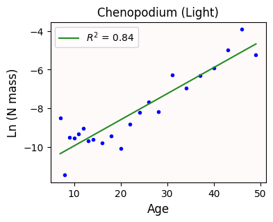
Can we do better?
3.2 Quadratic models: drawing parabolas
Bernacci et al (2007) originally proposed a quadratic model () instead of a linear one. Let’s use curve_fit!
Notice that we are essentially copy/pasting the code we already have for the linear model.
We are just editing the original curve function and renaming the variables.
In this case, our quadratic model must fit three parameters: a, b, and c.
# Quadratic function to optimize
# The x-axis parameter goes first
# Followed by the rest of parameters we want to estimate: slope and intercept
def quadratic(x, a, b, c):
    return a*x**2 + b*x + c

# Get the optimized quadratic parameters
qopt, qcov = optimize.curve_fit(quadratic, xvals, yvals)
print('The quadratic model has parameters:\t', qopt)

# Predict y-axis values
pred_y = quadratic(xvals, *qopt)

# Compare the true biomass values against the predicted values
qr2 = metrics.r2_score(yvals, pred_y)

qyaxis = quadratic(xaxis, *qopt) # predicted quadratic values for the previously defined 100 ages

# Plotting everything

fig, ax = plt.subplots(figsize=(4,3))
ax.set_facecolor('snow')
ax.scatter(xvals, yvals, c='b', marker='.')
ax.plot(xaxis, qyaxis, c='m', label=f'$R^2$ = {qr2:.2f}')
ax.set_xlabel('Age', fontsize=fs)
ax.set_ylabel('Ln (N mass)', fontsize=fs)
ax.set_title(f'{species.title()} ({gradient.title()})' , fontsize=fs)
ax.legend(loc='upper left');
The quadratic model has parameters: [ 1.87508600e-03 3.51781749e-02 -1.02958688e+01]
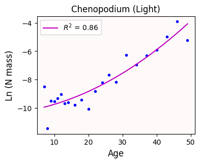
The quadratic curve looks a bit better than the line
With our quadratic model, age explains 86% of the variance observed in N biomass. That’s a slight improvement!
4. Fitting cubic functions, or the dangers of overfitting
What if we fit a cubic model instead (). Will that improve our results even further?
Notice that we just copy/pasted the code from above and made some edits
In this case, our cubic model uses four parameters.
# Cubic function to optimize
# The x-axis parameter goes first
# Followed by the rest of parameters we want to estimate: slope and intercept
def cubic(x, a, b, c, d):
    return a*x**3 + b*x**2 + c*x + d

# Get the optimized quadratic parameters
copt, ccov = optimize.curve_fit(cubic, xvals, yvals)
print('The cubic model has parameters:\t', copt)

# Predict y-axis values
pred_y = cubic(xvals, *copt)

# Compare the true biomass values against the predicted values
cr2 = metrics.r2_score(yvals, pred_y)

cyaxis = cubic(xaxis, *copt) # predicted cubic values for the previously defined 100 ages

# Plotting everything

fig, ax = plt.subplots(figsize=(4,3))
ax.set_facecolor('snow')
ax.scatter(xvals, yvals, c='b', marker='.')
ax.plot(xaxis, cyaxis, c='gray', label=f'$R^2$ = {cr2:.2f}')
ax.set_xlabel('Age', fontsize=fs)
ax.set_ylabel('Ln (N mass)', fontsize=fs)
ax.set_title(f'{species.title()} ({gradient.title()})' , fontsize=fs)
ax.legend(loc='upper left');
The cubic model has parameters: [-1.95971672e-04 1.79670645e-02 -3.46266991e-01 -7.84297931e+00]
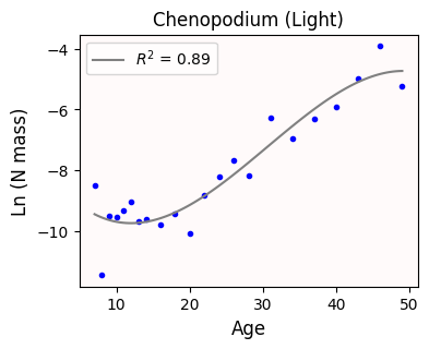
The cubic curve looks even better than the parabola.
With our quadratic model, age explains 89% of the variance observed in N biomass. Nice!
✅ Question 1
Let’s assume you are part of the Nitrogen Biomass Lab. Of the three models we have seen so far, which model would you use?
✎ Put your answer here.
4.1 Take a step back: are tightly-fitted curves actually good?
Remember that the true power of regression is that we can predict values—N biomass in this case—even when we don’t have those actual measurements.
In general, the more parameters we fit, the resulting curve will follow closer our datapoints.
But this risks overfitting: a model that can perfectly predict our recorded age values but it can be wildly wrong for age values we don’t have. This defeats the whole purpose of regression!
A good regression model should be a compromise between simplicity and information you can extract from it.
Let’s check how our three curves behave whenever we look a younger and older plants. Let’s look at age values from 1 day old to 70.
We draw vertical dashed lines to indicate which values are being extrapolated.
We also put some things in a list to loop later
# New sequence of day values
xaxis = np.linspace(1, 70, 200)

curve_function = [linear, quadratic, cubic]
opt = [lopt, qopt, copt]
color = ['forestgreen', 'm', 'gray']
title = ['linear', 'quadratic', 'cubic']

fig, ax = plt.subplots(1, len(opt), figsize=(12,3.5), sharex=True, sharey=True)
for i in range(len(ax)):
    yaxis = curve_function[i](xaxis, *opt[i])

    ax[i].set_facecolor('snow')
    ax[i].scatter(xvals, yvals, c='b', marker='.')
    ax[i].plot(xaxis, yaxis, c=color[i])
    ax[i].axvline(xvals.min(), c='k', ls='--', lw=0.5)
    ax[i].axvline(xvals.max(), c='k', ls='--', lw=0.5)
    ax[i].set_title(f'{title[i].title()} model')

#fig.suptitle(f'{species.title()} ({gradient.title()})' , fontsize=fs)
fig.supxlabel('Age', fontsize=fs)
fig.supylabel('Ln (N mass)', fontsize=fs)
fig.tight_layout()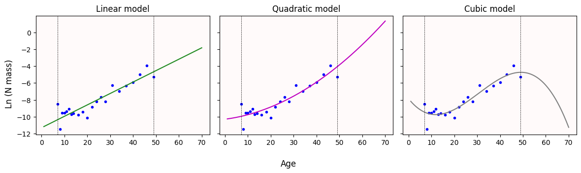
✅ Question 2
What do you notice with the curves once we try to predict N biomass values for older plants (plants older than 50 days)?
Does this change your answer from Q1?
✎ Put your answer here.
4.2 Confidence bands—or how you should never use cubic or higher polynomial models
(Unless you have a really good domain-knowledge reason to do so)
In general, you should avoid fitting polynomial curves of degree 3 (cubic) or higher. They produce really nice curves, but their behavior is extrememly erratic outside your observed range. Even if you don’t care about extrapolating, these high-degree polynomial are very sensitive to noise. And any real-life data will be noisy.
To illustrate the point better, let’s look at the 95% confidence bands.
Unlike the linear models, these confidence bands are not so simple to compute. The math behind it—the delta method—goes well beyond the scope of this course.
However, we still have a basic tool to get some sort of bands: bootstrap!
Like in In-Class 22, we get a bootstrapped paired sample
(x1, y1), ..., (xN, yN)Recompute the best-fit curve
Record
yaxis: the predicted values forxaxisRepeat steps 1–3 for
N = 1000timesGet the 0.025- and 0.975-th quantiles of all the predicted values (corresponding to 95% of confidence).
# The following might take a bit to run
# Bootstrapping for confidence bands for the three models
rng = np.random.default_rng(42)
N = 1000

# Arrays where the predicted values will be stored
lboot = np.zeros((N, len(xaxis)))
qboot = np.zeros((N, len(xaxis)))
cboot = np.zeros((N, len(xaxis)))

# Get bootstrapped indices, like in Day 22
idx = rng.integers(0, len(xvals), size=(N, len(xvals)) )

for i in range(N):
    # Bootstrapped x and y values
    x = xvals.iloc[idx[i]]
    y = yvals.iloc[idx[i]]

    # New curves fitted to these bootstrapped samples
    lopt_, _ = optimize.curve_fit(linear, x,y)
    qopt_, _ = optimize.curve_fit(quadratic, x,y)
    copt_, _ = optimize.curve_fit(cubic, x,y)

    # Predict curve values
    lboot[i] = linear(xaxis, *lopt_)
    qboot[i] = quadratic(xaxis, *qopt_)
    cboot[i] = cubic(xaxis, *copt_)

# Get the 0.025 and 0.975 quantiles (corresponding to 95% confidence)
lq = np.quantile(lboot, [0.025, 0.975], axis=0)
qq = np.quantile(qboot, [0.025, 0.975], axis=0)
cq = np.quantile(cboot, [0.025, 0.975], axis=0)
Finally, we plot the 95% confidence bands
boot = [lq, qq, cq]

fig, ax = plt.subplots(1, len(opt), figsize=(12,3.5), sharex=True, sharey=True)
for i in range(len(ax)):
    yaxis = curve_function[i](xaxis, *opt[i])

    ax[i].set_facecolor('snow')
    ax[i].scatter(xvals, yvals, c='b', marker='.')
    ax[i].fill_between(xaxis, boot[i][0], boot[i][1], alpha=0.25, color=color[i], ec=None, zorder=1)
    ax[i].plot(xaxis, yaxis, c=color[i])
    ax[i].axvline(xvals.min(), c='k', ls='--', lw=0.5)
    ax[i].axvline(xvals.max(), c='k', ls='--', lw=0.5)
    ax[i].set_title(f'{title[i].title()} model')
    ax[i].set_ylim(-12.5, 2)

fig.supxlabel('Age', fontsize=fs)
fig.supylabel('Ln (N mass)', fontsize=fs)
fig.tight_layout()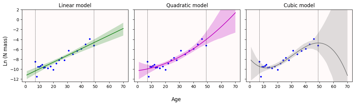
✅ Question 3
What do you notice with the 95% confidence bands once we try to predict N biomass values for older plants (plants older than 50 days)?
Does this change your answer from Q1?
✎ Put your answer here.
Congratulations, you’re done!
Submit this assignment by uploading it to the course Canvas web page. Go to the “Pre-class assignments” folder, find the appropriate submission folder link, and upload it there.
See you in class!
© Copyright 2026, Division of Plant Science & Technology—University of Missouri
- BERNACCHI, C. J., THOMPSON, J. N., COLEMAN, J. S., & MCCONNAUGHAY, K. D. M. (2007). Allometric analysis reveals relatively little variation in nitrogen versus biomass accrual in four plant species exposed to varying light, nutrients, water and CO2. Plant, Cell & Environment, 30(10), 1216–1222. 10.1111/j.1365-3040.2007.01698.x